This tutorial shows you how to create APA style charts in SPSS. Charts are referred to as “figures” in the APA Style guidelines and include bar charts, pie charts, line graphs, scatter plots, histograms, and so on.
Quick Steps
- Create your desired chart in SPSS
- Double-click on the chart in the SPSS Output Viewer
- Select the box containing your chart title and select an appropriate font size.
- Select the Bold, Italic, and Left Align icons to format your chart title.
- Click File -> Apply Chart Template
- Select APA_Styles.sgt
- Click Open
- Select Options -> Title
- Replace the word Title with Figure X
- Click on another part of the chart then click on the box containing the Figure X text
- Click the Align Left icon for the Figure X text
- Click Options -> Hide Grid Lines (recommended)
- Select frame around your chart (recommended).
- In the Properties dialog box check the box next to Border and select the Transparent icon from the color palette (recommended).
- Click Apply
- Select X to close the Chart Editor
Create Your Chart in SPSS and Open the Chart Editor
The first step is to create your desired chart in SPSS. See our tutorials on creating histograms, simple bar charts, clustered bar charts, stacked bar charts, pie charts, and scatter plots in SPSS.
Be sure to add a brief but descriptive title when you create your chart. APA style requires that charts have titles. Although it is possible to add a title to your SPSS chart after you have created it, it is easier to add it at the time you create the chart.
Double-click on your chart in the SPSS Output Viewer to open the Chart Editor. You may find it helpful to maximize the Chart Editor window before you start to edit your chart.
Format Your Chart Title
The next step is to format your chart title in the APA style. First, select the box containing your chart title as illustrated below:
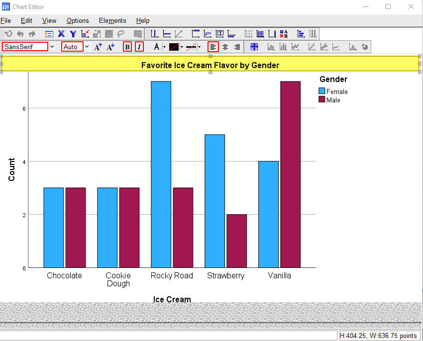
The SansSerif option should already be selected. We recommend that you change Auto to an appropriate font size (we selected 12). If you do not take this step, the font size may change when you apply the APA Style chart template in the step below.
APA chart titles should be italicized but not bold. Select the Bold (B) icon so that the title is no longer in boldface. Next, select the Italic (I) icon to italicize it. Finally, select the Align Left icon.
Apply the APA Style Chart Template to Your Chart
Click File -> Apply Chart Template
This brings up the Apply Template folder as illustrated below.
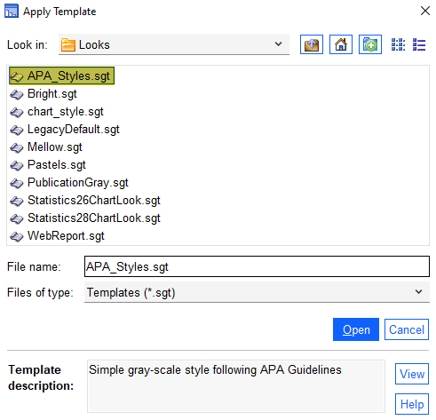
Select APA_Styles.sgt
Click Open to apply the APA Styles template.
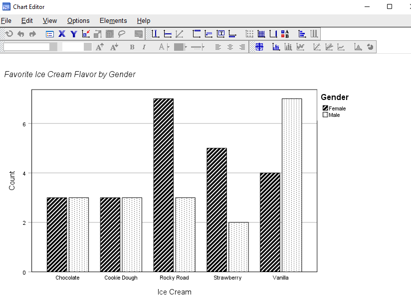
Your chart should now look something like the following. In addition to applying the APA chart template, you may also notice that SPSS has opened a Properties dialog box. We will return to this in a moment.
Add a Figure Number to Your Chart
The next step is to add figure number to your chart. To to this select Options -> Title as illustrated below.
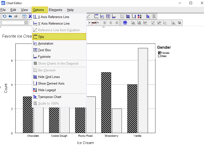
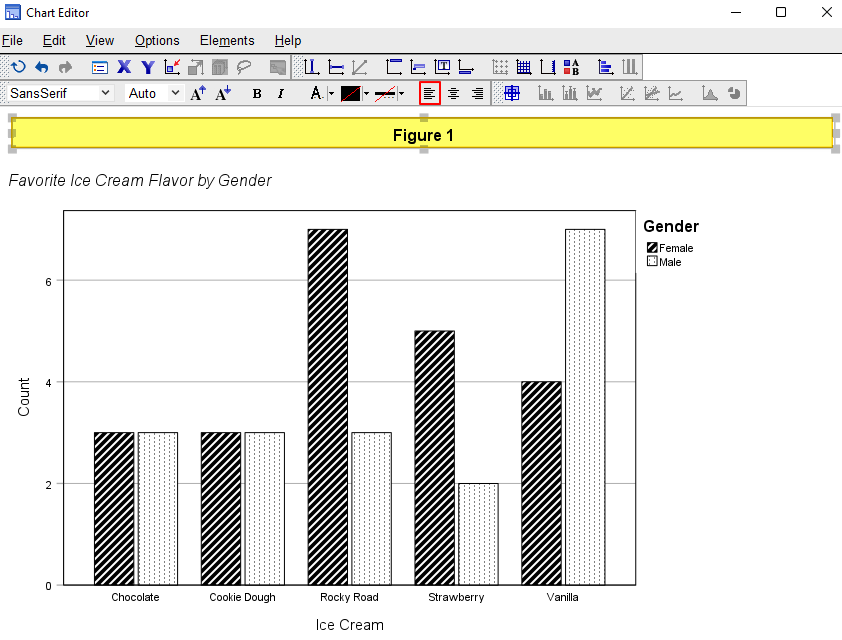
SPSS will add an additional title box to your chart. Select the word “Title” and replace it with Figure X as per the illustration below. If this is the first figure that will appear in your report, it is Figure 1.
In APA style charts, the figure number is bold and left aligned. Click away from the “Figure X” text and then select the box containing the figure text. Select the Align Left icon outlined in red below.
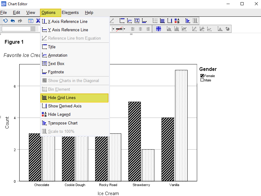
Remove Gridlines from Your Chart (Recommended)
Unless there is a good reason to keep them, you should remove grid lines from APA charts. The easiest way to do this is to click Options ->Hide Grid Lines as per the screenshot below.
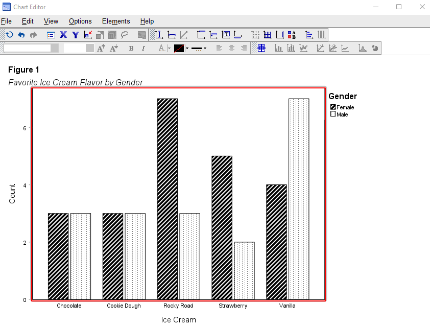
Remove the Frame from Your Chart (Recommended)
You should also remove the frame around your chart (highlighted in red below) as follows. First, select the frame.
In the Properties dialog box select the box to the left of Border and select the Transparent option from the color palette (this is a white box with by a red diagonal line).
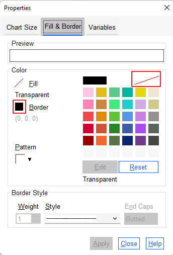
Click Apply.
Click Close.
Chart Notes and Other Edits
If you need to add any notes to your chart, these should be placed below the chart.
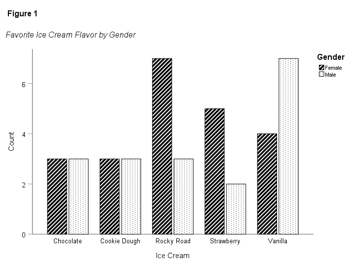
Make any other edits you wish to make – please see our tutorials on editing bar charts and pie charts. In our example, we increased the font size for the numbers on the Y axis and the ice cream flavors on the X axis.
Save Your APA Style Chart
Then select the “X” at the top right corner of the “Chart Editor” window – the edits to your chart will be saved. Our APA Style chart is illustrated below.
If you wish to export your chart for use in another application such as Word, Excel, or PDF, check out our tutorial on exporting SPSS output to other applications. Alternatively, you can right click on your chart in the SPSS Output Viewer and copy it as an image file to use in other programs.
***************
That’s it for this tutorial. You should now be able to create APA Style charts in SPSS.
***************