In this tutorial we show you seven edits that can make your SPSS pie charts better. Select the edits that work best for your own pie chart, and remember that the goal of your edits is to communicate your data to your audience as clearly as possible.
1. Editing Your Pie Chart in SPSS
After you create a pie chart in SPSS, the Output Viewer will pop up with your new chart. To edit your pie chart, double-click on it to open the “Chart Editor.” You may find it helpful to maximize the “Chart Editor” window before you start making edits.
Adding a Title to Your Pie Chart
If you did not add a title to your pie chart when you created it, you can add one by selecting Options -> Title.
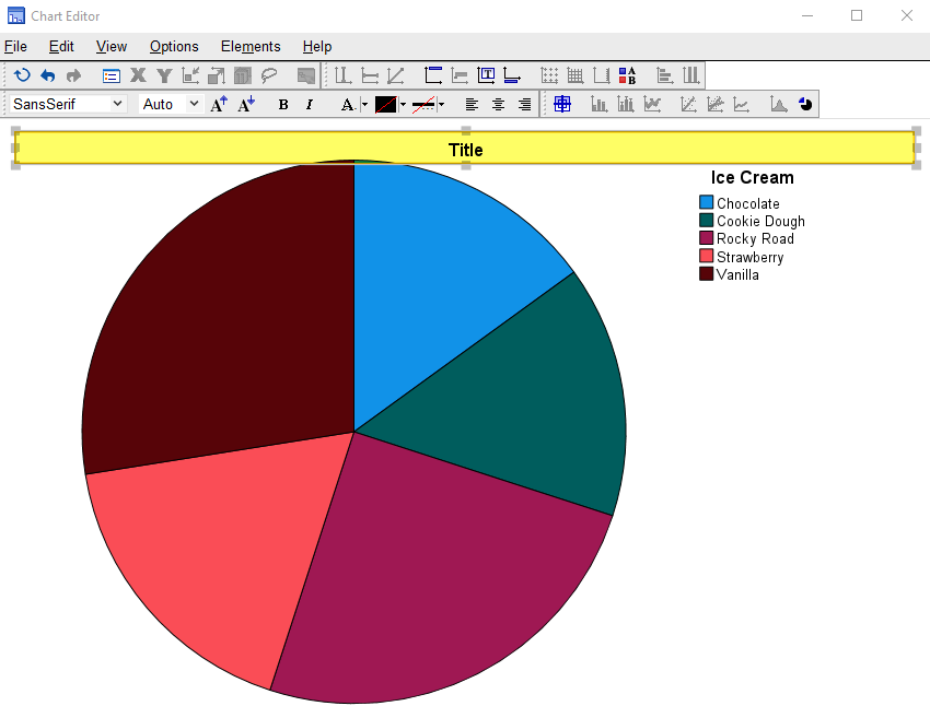
SPSS will add a title box to your pie chart with the default text “Title” as illustrated below. Overtype this text with the title you want to add to your pie chart, then click outside of the title box.
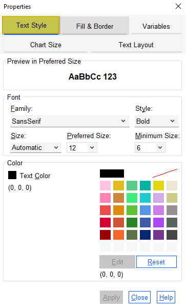
If you want to change the font type, size, style, or color of your title, click on the title box again. You will see that SPSS has opened a “Properties” dialog box. Select the “Text Style” tab of this dialog box as illustrated below. Select your preferred option(s) for your title text and click “Apply”.
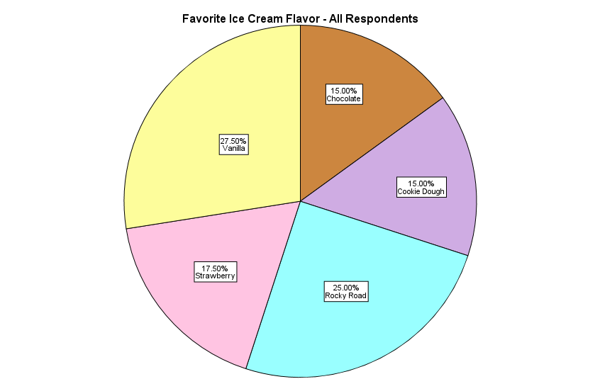
2. Adding Percentages/Numbers (Frequencies) to Each Slice of the Pie
To add percentages or numbers (frequencies) to each slice of the pie, click Elements -> Show Data Labels. (Note that if “Show Data Labels” is greyed out, clicking on the pie chart should activate this option).
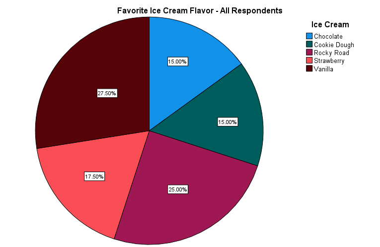
This adds the percentages/numbers to the slices of your pie chart as illustrated below.
3. Adding Category Value Labels to the Pie Chart
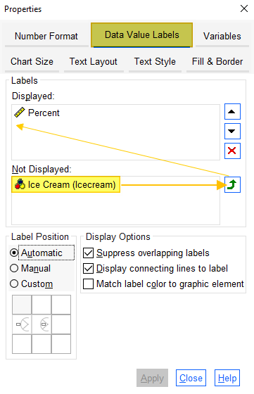
If you want to display the category value labels on the slices of your pie chart, and you have added percentages/numbers to each slice of the pie as described above, the “Properties” dialog box will be open at the “Data Value Labels” tab as illustrated below. Click on the variable in the “Not Displayed” box and use the arrow to move it to the “Displayed” box as illustrated below.
Click “Apply.”
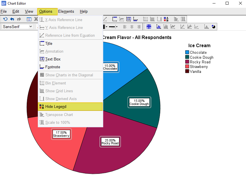
4. Hiding the Pie Chart Legend
If you have added the category value labels to the pie chart slices as described above, you may wish to remove the legend by clicking Options -> Hide Legend as illustrated below.
5. Changing the Colors of Your Pie Chart
To change the color of your pie chart, click once on the chart, and then click once on the (first) slice of the pie that you wish to edit. (Note that if changing the colors is the first edit you make to your pie chart, you will need to take the additional step of selecting Edit -> Properties in the Chart Editor). You will see that the “Fill & Border” tab is now selected in the “Properties” dialog box as illustrated below. Note that “Preview” and “Fill” both display the color of the slice of the pie that you selected.
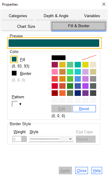
Select your chosen color for the pie slice from the palette provided. The new color will be displayed in both “Preview” and “Fill.”
Select “Apply.” If you see a warning message stating “The border color will not be visible until its weight is set to a value greater than 0,” click “OK.”
If you want to change the color of another slice, click (once) on that slice and repeat the steps above.
6. Changing the Size of Your Pie Chart
If the “Properties” dialog box is open, click on the “Chart Size” tab. (If the “Properties” dialog box is not open, select Edit -> Properties to open it).
Ensure that the “Maintain aspect ratio” box is checked as illustrated below. Then use the up and down arrows to change the height and width of the chart as needed.
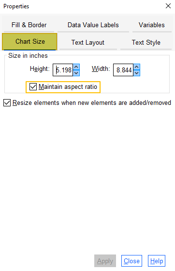
Click “Apply.”
7. Formatting Your SPSS Pie Chart in APA Style
We have a dedicated tutorial that shows you how to format your SPSS chart in APA style.
Undoing Edits to Your Pie Chart
If you want to undo any of the edits you have made to your pie chart, you can take one of the steps below:
- To reverse your most recent edit, click Edit -> Undo (shortcut CTRL+Z in Windows)
- To return to the original version of your chart, click Edit -> Reset (shortcut CTRL+R in Windows)
Saving Your Edited Pie Chart
Once you have finished making edits to your pie chart, click “Close” to close the “Properties” dialog box. Then select the “X” at the top right corner of the “Chart Editor” window – the edits you have made to your pie chart will be saved.
You can right-click on your chart within the Output Viewer and copy it as an image file (which you can then use in other programs). Alternatively, check out our tutorial on exporting SPSS output to other applications such as Word, Excel, or PDF.
***************
That’s it for this tutorial. You should now be able to edit a pie chart within SPSS.
***************