Scatter plots allow us to visualize the relationship between two numeric variables. This quick tutorial will show you the easiest method to create a simple scatter plot in SPSS.
Quick Steps
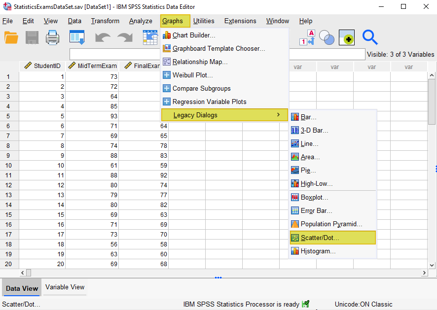
- Click Graphs -> Legacy Dialogs -> Scatter/Dot (in older versions of SPSS) OR
Click Graphs > Scatter/Dot (in newer versions of SPSS) - Select Simple Scatter
- Click Define
- Click Reset (recommended)
- Select the predictor/independent variable and move it into the X Axis box
- Select the criterion/dependent variable and move it into the Y Axis box
- Select Titles to add a title (recommended), then click Continue
- Select OK
- Your scatter plot will appear in SPSS Output Viewer
- Double-click on your scatter plot to open the Chart Editor
- Click Elements -> Fit Line at Total
- Ensure that Linear is selected under Fit Method
- Click Close
- Click X in the top right corner of the Chart Editor to save your edits.
The Data
The starting assumption for this tutorial is that you have already imported your data into SPSS, and that you’re looking at something like the data set below. (Check out our tutorials on importing data from Excel or MySQL into SPSS).
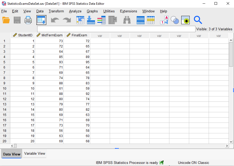
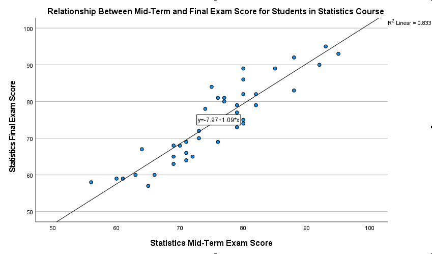
This hypothetical data set contains the mid-term and final exam scores of 40 students in a Statistics course (the first 20 records are displayed above). We want to create a scatter plot to visualize the relationship between the two sets of scores.
Create a Scatter Plot
Click Graphs -> Legacy Dialogs -> Scatter/Dot as illustrated below. Note, however that in newer versions of SPSS, you will need to click Graphs > Scatter/Dot.
This brings up the Scatter/Dot dialog box:
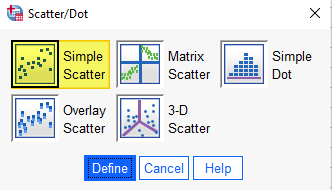
Select Simple Scatter and then click Define.
This brings up the “Simple Scatterplot” dialog box below.
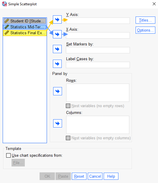
We recommend that you click the Reset button to clear any previous settings.
The next step is to move your variables into the X Axis and Y Axis boxes. If your data is from a regression study, select your predictor/independent variable, and use the arrow button to move it to the X Axis. Then select the criterion/dependent variable, and use the arrow button to move it to the Y Axis box. If your data is from a simple correlation study, as is the case with our example, there may not be obvious predictor/independent and criterion/dependent variables. In these cases, it doesn’t matter which variable you move to the X Axis box and which variable you move to the Y Axis box.
It is a good idea to give your scatter plot a title. To do this, click the Titles button, add your title, and click Continue to return to the “Simple Scatterplot” dialog box.
Select OK to generate your scatter plot.
The Scatter Plot
The SPSS Output Viewer will pop up with the scatter plot that you’ve created.
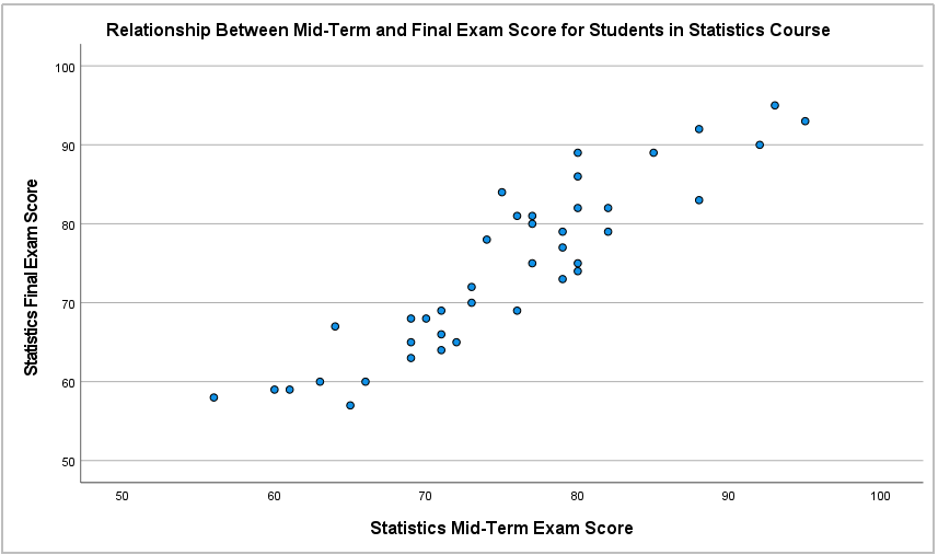
Each student in our hypothetical study is represented by one dot on our scatter plot. Each dot’s position on the X (horizontal) axis represents a student’s mid-term exam score, and its position on the Y (vertical) axis represents their final exam score.
After we create a scatter plot, we need to review it to assess the nature of the relationship – if any – that exists between our variables. The scatter plot above indicates that there is a positive linear relationship between mid-term and final exam scores in this Statistics course. In other words, lower mid-term exam scores tend to be associated with lower final exam scores, and higher mid-term exam scores tend to be associated with higher final exam scores. It is important to note that a scatter plot cannot prove a causal relationship between variables. Therefore, we cannot conclude that high mid-term exam scores cause high final exam scores on the basis of the scatter plot above.
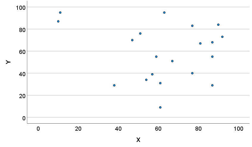
Some of the other relationships between variables that your scatter plot may indicate are illustrated below.
|
|
|
|
Positive Monotonic Relationship Between Variables. |
Negative Monotonic Relationship Between Variables. |
|
|
|
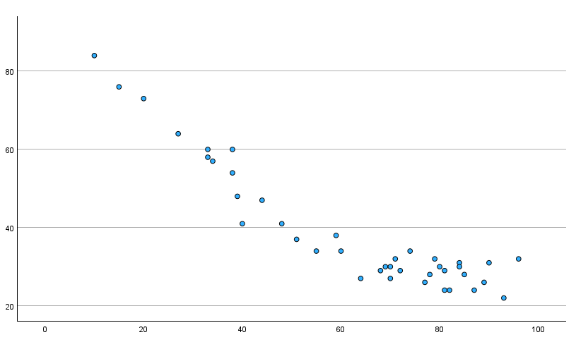
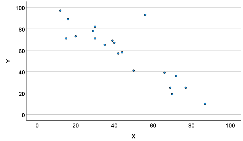 Negative Linear Relationship Between Variables
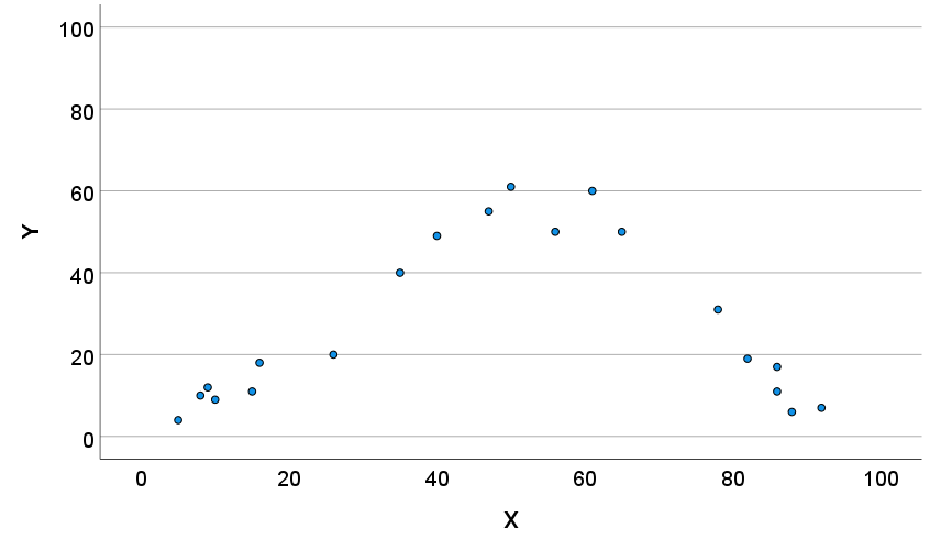 Curvilinear Relationship Between Variables
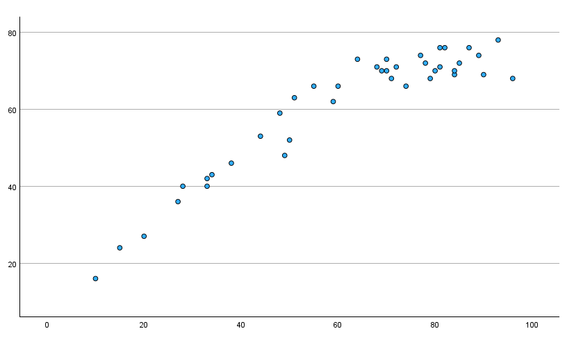
Adding a Line of Best Fit to Your Scatter Plot
If you want to add a line of best fit/regression line to your scatter plot, double click on the scatter plot in your Output Viewer to open the “Chart Editor.” Then click Elements -> Fit Line at Total. A “Properties” dialog box will open. Ensure that the default option Linear is selected as the Fit Method. Click Close to return to your scatter plot.
Once you have added your line of best fit, select the X at the top right corner of the “Chart Editor” window to save your updated scatter plot (illustrated below).
You can right-click on your scatter plot within the Output Viewer and copy it as an image file (which you can then use in other programs). Alternatively, check out our tutorial on exporting SPSS output to other applications such as Word, Excel, or PDF.
***************
That’s it for this quick tutorial. You should now be able to create a scatter plot in SPSS. You may find it easier, however, to create a scatter plot using the free Scatter Plot Maker at StatsCharts.com
***************