This tutorial will show you the quickest method to create a clustered bar chart to visualize the relationship between two variables in the SPSS statistical package.
Quick Steps
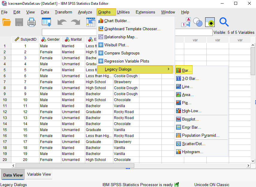
- Click Graphs -> Legacy Dialogs -> Bar
- Select “Clustered” and “Summaries for groups of cases”
- Click Define
- Select the variable you wish to display on the horizontal axis, and move it into the “Category Axis” box
- Select the second variable, and move it to the “Define Clusters by” box
- Select your desired option under “Bars Represent”
- Select “Titles” to add a title (recommended)
- Click OK
The Data
As usual with these quick tutorials, the starting assumption is that you have already imported data into SPSS, and you’re looking at something like the data set below. (Check out our tutorials on importing data from Excel or MySQL into SPSS).
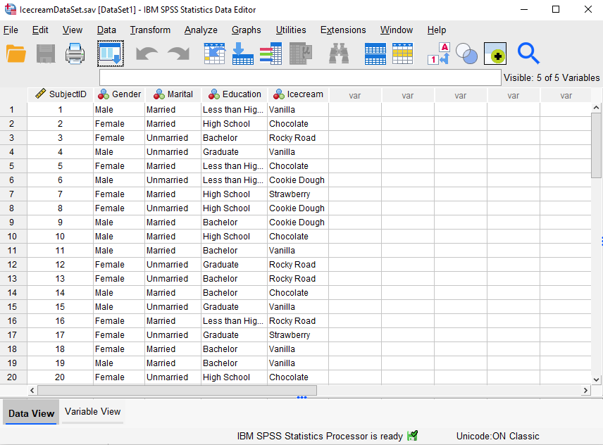
The data in this file (first 20 records displayed) represent the favorite ice cream flavor of each respondent, together with their gender, marital status, and level of education. We want to compare the favorite ice cream flavors of our male and female respondents. A clustered bar chart will help us to visualize the relationship between these two variables.
Create a Clustered Bar Chart
The simplest and quickest way to create a clustered bar chart in SPSS is to select Graphs -> Legacy Dialogs -> Bar, as illustrated below:
This brings up the following dialog box:
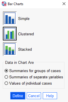
Select the “Clustered” bar chart icon. Under “Data in Chart Are”, select “Summaries for groups of cases.”
Click “Define.”
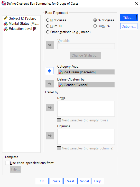
This brings up the “Define Clustered Bar: Summaries for Groups of Cases” dialog box below.
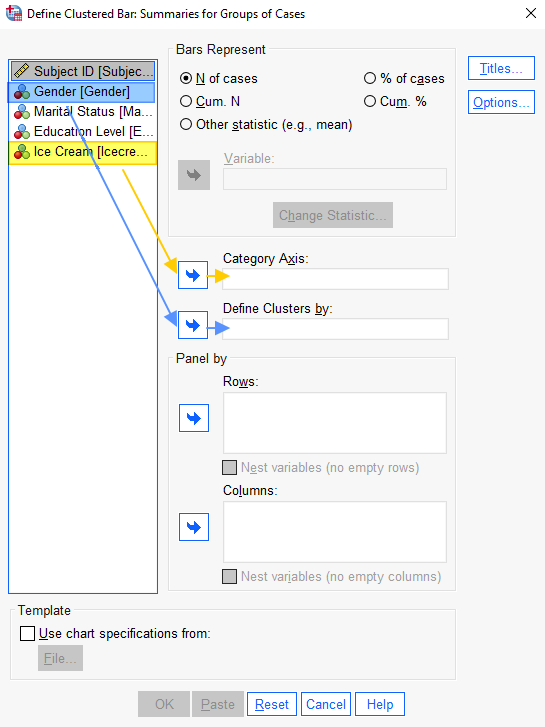
Select the variable that you wish to place on the horizontal-axis of your bar chart (Ice Cream in our example), and use the arrow button to add it to the “Category Axis” box. Select the second variable (Gender in our example), and use the arrow to add it to the “Define Clusters by” box.
Select your desired option under “Bars Represent.” For this chart, we want to display “% of cases.”
It is a good idea to give your chart a title. Select the “Titles” button, add your chart title, and select “Continue” to return to the “Define Clustered Bar: Summaries for Groups of Cases” dialog box.
Select “OK” to generate your chart.
The Clustered Bar Chart
The SPSS output viewer will pop up with the clustered bar chart that you’ve created.
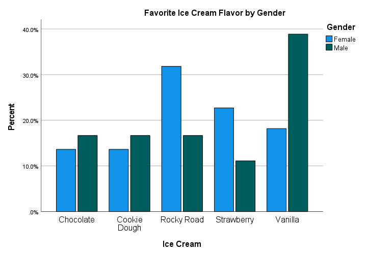
Note that the sum of the percentages for the female respondents (blue bars) is 100%, and the sum of the percentages for the male respondents (green bars) is also 100%. We can see from this chart that a larger percentage of female respondents stated that their favorite ice cream flavor was Rocky Road or Strawberry when compared with the male respondents. A larger percentage of male respondents stated that their favorite ice cream flavor was Vanilla. There are smaller differences between the percentage of male and female respondents who stated that their favorite ice cream flavor was Chocolate or Cookie Dough.
If you want to save your chart, you can right-click on it within the output viewer, and copy it as an image file (which you can then use in other programs). Alternatively, check out our tutorial on exporting SPSS output to other applications such as Word, Excel, or PDF.
***************
That’s it for this quick tutorial. You should now be able to create a clustered bar chart within SPSS using one of its legacy tools. You may also be interested in our tutorials on editing bar charts in SPSS and formatting SPSS charts in APA style.
You may find it easier to create a clustered bar chart using the free Bar Chart Maker at StatsCharts.com
***************