This tutorial will show you the quickest method to create a simple bar chart in the SPSS statistical package.
Quick Steps
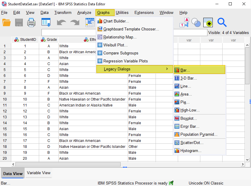
- Click Graphs -> Legacy Dialogs -> Bar
- Click Define
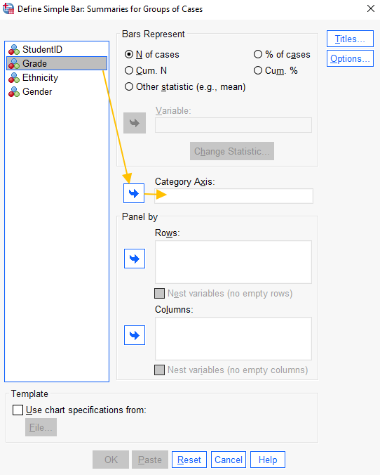
- Select the variable for which you wish to create a bar chart, and move it into the “Category Axis” box.
- Select “Titles” to add a title (recommended)
- Click Continue after you have added a title
- Click OK
- Your bar chart will appear in the SPSS viewer window
The Data
As usual with these quick tutorials, the starting assumption is that you have already imported data into SPSS, and you’re looking at something like the data set below. (Check out our tutorials on importing data from Excel or MySQL into SPSS).
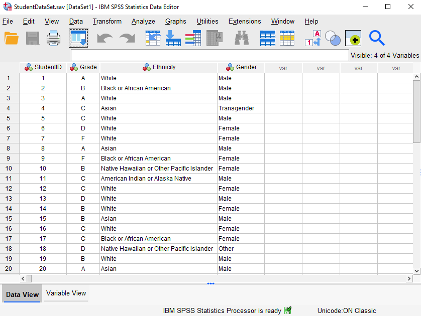
The data in this file represent the grades achieved by 20 students, together with their ethnicity and gender. The variable we’re interested in is grade. Specifically, we want to know how the frequency of grades is distributed. A bar chart will help us to visualize this.
Create a Bar Chart
The simplest and quickest way to create a bar chart in SPSS is to select Graphs -> Legacy Dialogs -> Bar, as illustrated below:
This brings up the following dialog box:
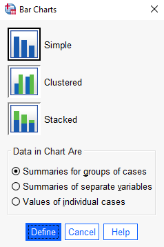
Select the ‘Simple’ bar chart. Under ‘Data in Chart Are’, select ‘Summaries for groups of cases’.
Click “Define”.
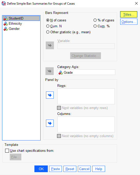
This brings up the following dialog box. Select the variable for which you wish to create a Bar Chart (“Grade” in this example), and add it to the “Category Axis’ box by selecting the arrow button to the left of the box.
Select your desired option from “Bars Represent”. We want this bar chart to display the number of cases for each variable, so the “N of cases” option is correct.
It is a good idea to give your bar chart a title. Select the “Titles” button to do this:
Add the title of your chart and select “Continue”.
Select “OK” to generate your bar chart.
The Bar Chart
The SPSS output viewer will pop up with the bar chart that you’ve created.
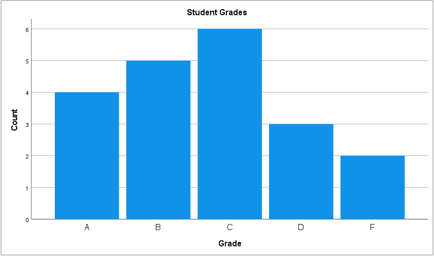
The y-axis (on the left) displays the number of students who achieved each grade, and the x-axis (across the bottom) displays the value of the variable (in this case Grade).
If you want to save your bar chart, you can right-click on it within the output viewer, and copy it as an image file (which you can then use in other programs). Alternatively, check out our tutorial on exporting SPSS output to other applications such as Word, Excel, or PDF.
***************
That’s it for this quick tutorial. You should now be able to create a simple bar chart within SPSS using one of its legacy tools. See our tutorials on editing bar charts in SPSS and formatting SPSS charts in APA style. You may also be interested in our tutorials on creating clustered and stacked bar charts in SPSS.
You may find it easier to create a simple bar chart using the free Bar Chart Maker at StatsCharts.com
***************