SPSS allows users to make a wide variety of edits to their bar charts. In this tutorial we will show you the easiest way to make some of the most common and useful edits using the same simple bar chart. Please see our dedicated tutorial if you wish to format your SPSS chart in APA style.
You can either read the whole tutorial or jump to the section(s) you need using the Table of Contents. Whichever edits you make, you will need to start by opening the “Chart Editor” and end by saving your edited bar chart. At any point before you save your chart, you can opt to undo some or all the edits that you have made.
This tutorial starts from the assumption that you have already created a simple, clustered, or stacked bar chart in SPSS, and that the Output Viewer has popped up with your chart.
Opening the “Chart Editor”
To edit your bar chart, double-click on it in the SPSS Output Viewer to open the “Chart Editor.” You may find it helpful to maximize the “Chart Editor” window before you start making edits.
Adding a Title to Your Bar Chart
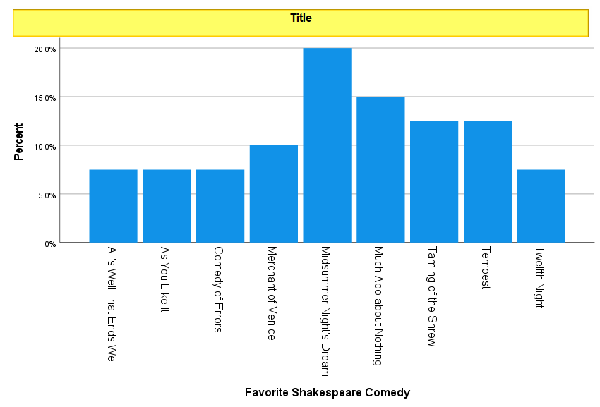
If you did not add a title to your bar chart when you created it, you can add one by selecting Options -> Title.
SPSS will add a title bar to your chart with the default text “Title” as illustrated below. Overtype this text with the title you want to add to your bar chart, then click outside of the title box.
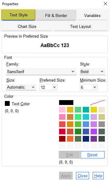
If you wish to change the font type, size, style, or color, click on the title box again. SPSS should have opened a “Properties” dialog box when you added a title to your chart. Select the “Text Style” tab of this dialog box as illustrated below. Select the option(s) you wish to apply to your title text and click “Apply.”
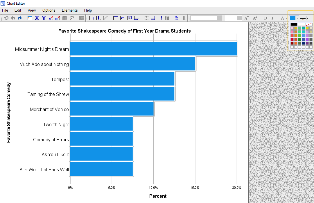
Creating a Horizontal Bar Chart
By default, SPSS creates vertical bar charts. However, some bar charts are easier to understand when the bars are horizontal rather than vertical. You can convert your vertical bar chart into a horizontal bar chart as follows:
Click Options -> Transpose Chart
A common reason for creating a horizontal bar chart is when you have long category labels, as illustrated below.
You may find it easier to create a horizontal bar chart using the free Horizontal Bar Graph Maker at StatsCharts.com
Changing the Order of the Bars in Your Bar Chart
It will be easier for other people to understand your bar chart, if the bars are ordered in a meaningful way. This usually means ordering the bars by value, with the highest value bar being placed first.
Click Edit -> Select X Axis
This brings up the “Properties” dialog box.
First ensure that the variable that your bars represent is selected as highlighted below.
To order the bars in your chart by value (such as the percentage or count of the bars), change ‘”Sort by” to “Statistic.” Then set the “Direction” to “Ascending” for horizontal bar charts and to “Descending” for vertical bar charts.
(To order the bars in your chart alphabetically by the variable categories, change “Sort by” to “Label.” Then change the “Direction” to “Descending” for horizontal bar charts and to “Ascending” for vertical bar charts).
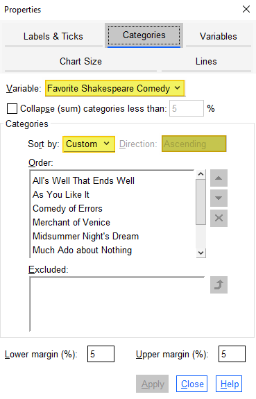
Click “Apply.”
Changing the Color(s) of Your Bar Chart
For a Simple Bar Chart (One Color)
The easiest way to change the color of the bars of a simple bar chart is as follows:
Click (once) on the bars in your bar chart. This brings up a box on your menu bar that will be the same color as the bar(s) you have selected. Click on the down arrow next to that colored box, and select your preferred color from the palette provided as illustrated below.
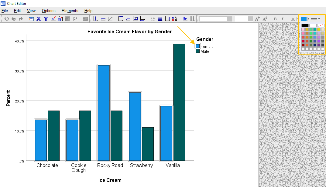
For Clustered and Stacked Bar Charts (Multiple Colors)
If you wish to change one or more of the colors used in a clustered or stacked bar chart, the process is slightly different. With these multi-color bar charts, the easiest approach is to click once on the chart legend, and then click on one of the color boxes within that legend as indicated below. When you do this, SPSS selects the bars of that color (or the stacks of that color in a stacked bar chart). In addition SPSS brings up a box on your menu bar that will be the same color as the box that you selected in your legend. Click on the down arrow next to the color box in the menu bar, and select your preferred color from the palette provided. Repeat these steps as needed to change the other colors in your bar chart.
Adding Value Labels to Your Bars
Adding Value Labels to Your Bars
To add value labels to the bars of a simple bar chart, click Elements -> Show Data Labels. (Note that if “Show Data Labels” is greyed out, clicking on any of the bars of your bar chart should activate this option).
If you are working with a clustered bar chart, ensure that all of your bars are selected before clicking Elements -> Show Data Labels.
You will see that the statistic that your bars represent (usually the number of cases or percentage of cases) will now be displayed on your bars. At the same time, a “Properties” dialog box will pop up. You can format these labels in various ways using this dialog box.
Changing the Position of Value Labels on Your Bars
You can change the position of the value labels on your bar chart in the “Data Value Labels” tab of the “Properties” dialog box. For example, to have the labels appear at the top of each bar (for a vertical bar chart) or at the right-hand side of each bar (for a horizontal bar chart), select “Custom” under “Label Position” and the top box immediately underneath the “Custom” option as illustrated below.
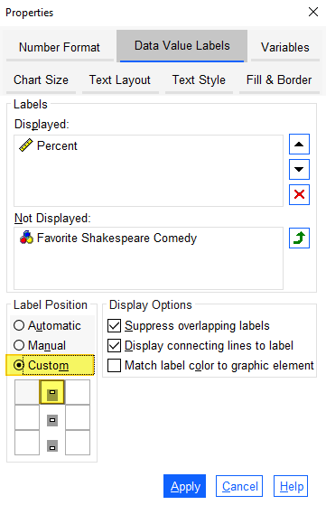
Click “Apply.” Our example bar chart is illustrated below with the label position customized as outlined above.

Formatting the Value Labels on Your Bars
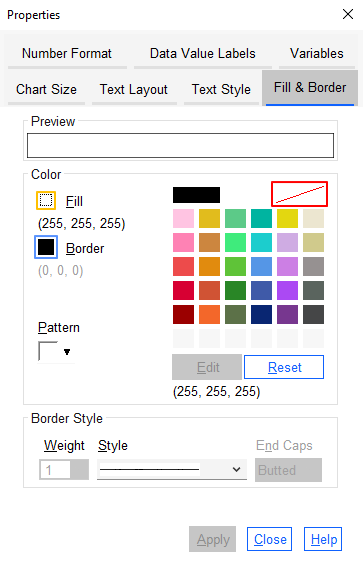
To change the format of your value labels, double click on one of the data values. This brings up the “Properties” dialog box. Select the “Fill & Border” tab (if it isn’t already selected).
To change the fill color of the value label boxes from the default of white, click the box to the left of “Fill” (outlined in gold in the screenshot below) and select your preferred color. If you want to make the fill box “transparent” so that it matches the color of your bars, select the white rectangle with the red diagonal line (outlined in red).
To change the border color of the value label boxes outline color from the default of black, click the box to the left of “Border” (outlined in blue) and select your preferred color. Again, if you want to make the box outline “transparent” so that it matches the color of your bars, select the white rectangle with the red diagonal line (outlined in red).
Select “Apply.”
If you want to edit the font family, style, size, or color you can do so from the “Text Style” tab of the “Properties” dialog box. I have opted for Arial, bold, preferred size 12, white font. Click “Apply.” The screenshot below shows the results of all of the modifications made to our simple bar chart in this section on “Adding Value Labels to Bars.”

Changing the Scale (Y) Axis
You can change the range or increments of the scale (Y) axis of your bar chart as follows:
Click Edit -> Select Y Axis
This brings up the “Properties” dialog box at the “Scale” tab. Note that all of the options under “Range” are set to “Auto,” and that the minimum and maximum values of the data represented in our bar chart are displayed under “Data” as illustrated below.
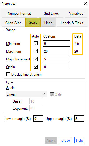
To make changes to any of the “Auto” values, uncheck the relevant “Auto” box, and then overtype the number in the “Custom” box. There are a couple of important points to note here.
First, the “Minimum” for your bar chart should not be more than 0.
Second, if you modify any of the values under “Range”, SPSS may automatically change the other scale values (you may not see the impact of these changes until you close the dialog box). For this reason, if you wish to change any of the “Auto” values on your bar chart scale, we recommend unchecking all of the “Auto” boxes. This prevents SPSS from making unwanted changes to your bar chart.
Click “Apply” after you made your changes.
Removing Value Labels from the Scale (Y) Axis
If you have added value labels to the bars of your bar chart, you may wish to remove the values from the scale (Y) axis. For example, in the example below, we have labelled each bar with it’s percentage value, and we may opt to remove the percentage labels from the axis scale as highlighted.

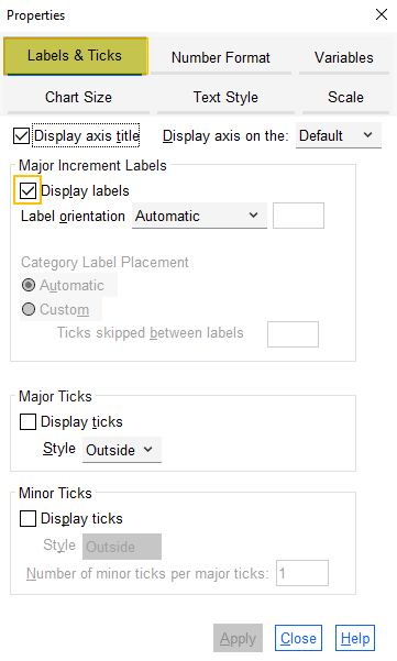
The easiest way to do this is to right-click on any of the value labels on your axis scale. This selects all of the labels on the scale and brings up the menu below. Select “Properties Window.”
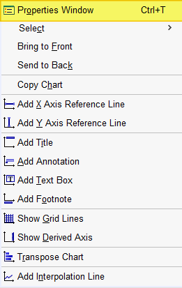
Click on the “Labels & Ticks” tab, and uncheck the “Display labels” box as illustrated below.
Click “Apply.”
Removing Axis Titles from Your Bar Chart
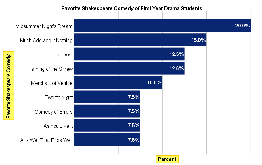
You should only remove axis titles from your bar chart if the other elements of the chart – such as the chart title and the value labels on the bars of your chart – make the axis titles redundant. For example, in the bar chart illustrated below the label “Favorite Shakespeare Comedy” along the left hand side of the chart is redundant because this information is included in the chart title. Similarly, the label “Percent” at the bottom of the chart is redundant because the the values on each bar include the % sign.
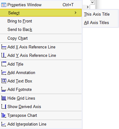
To remove axis titles, right click on one of the titles that you wish to remove to bring up the menu below. If you want to remove only the axis title selected, click Select -> This Axis Title. If you want to remove the title for both axes, click Select -> All Axis Titles.
This brings up the “Properties” dialog box. Click the “Labels & Ticks” tab and uncheck the “Display axis title” box as illustrated below.
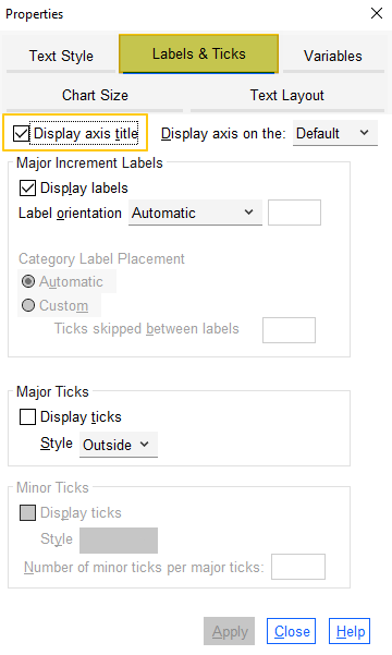
Click “Apply.” Our updated bar chart is illustrated below.

Removing Grid Lines from Your Bar Chart
The easiest way to remove grid lines from your bar chart is to click Options ->Hide Grid Lines
Removing the Frame from Your Bar Chart
By default, SPSS adds a frame to the top and right-hand sides of each bar chart. The easiest way to remove these frames is to right click on one of the frames that you wish to remove to bring up the menu below. If you want to remove only the axis line selected, click Select -> This Axis Line. If you want to remove both axis lines, click Select -> All Axis Lines.
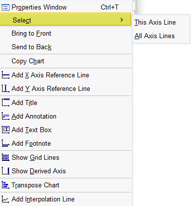
This brings up the “Properties” dialog box. Click the “Lines” tab and select the white rectangle with the red diagonal lite (outlined in gold below) to make your axis line(s) transparent as illustrated below.
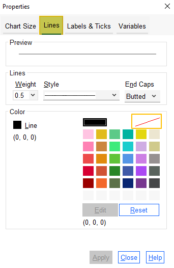
Click “Apply.” Our updated bar chart is illustrated below.

Changing the Size of Your Bar Chart
If the “Properties” dialog box is open, click on the “Chart Size” tab. Alternatively, select Edit -> Properties to open it.
Ensure that the “Maintain aspect ratio” box is checked as illustrated below. Then use the up and down arrows to change the height and width of the chart as needed.
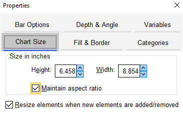
Click “Apply.”
Undoing Edits to Your Bar Chart
If you want to undo any of your edits, you can take one of the steps below:
- To reverse your most recent edit, click Edit -> Undo (shortcut CTRL+Z in Windows)
- To return to the original version of your chart, click Edit -> Reset (shortcut CTRL+R in Windows)
Saving Edits to Your Bar Chart
Once you have finished making edits to your bar chart, click “Close” to close the “Properties” dialog box. Then select the “X” at the top right corner of the “Chart Editor” window – your edits will be saved.
You can right click on your bar chart within the Output Viewer and copy it as an image file. You can then use this file in other programs. Alternatively, check out our tutorial on exporting SPSS output to other applications such as Word, Excel, or PDF.
Formatting Your SPSS Bar Chart in APA Style
As noted in the introduction, we also have a dedicated tutorial that shows you how to format your SPSS chart in APA style.
***************
That’s it for this tutorial. You should now be able to edit a bar chart within SPSS.
***************