Side-by-side boxplots (or box and whisker plots) are a way of visually comparing the distribution of numeric data using the “five number summary” – the minimum, first quartile, median, third quartile, and maximum values – of two or more groups. They also allow us to identify any outliers that may exist in our data. This tutorial will show you the easiest way to create side-by-side boxplots for multiple groups or levels of a numeric variable in SPSS.
Quick Steps
- Click Graphs -> Boxplots in SPSS version 29
Click Graphs -> Legacy Dialogs -> Boxplots in earlier versions of SPSs - Select Simple and Summaries for groups of cases
- Click Define
- Click Reset (recommended)
- Select the numeric variable for which you wish to create boxplots, and move it into the Variable box
- Select the categorical variable that you want to use to use to group the data in your boxplots, and move it into the Category Axis box
- Click OK
The Data
We start with the assumption that you have already imported your data into SPSS, and that you’re looking at something like the data set below. (Check out our tutorials on importing data from Excel or MySQL into SPSS).
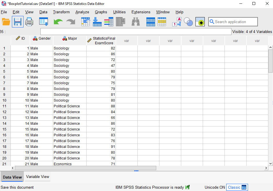
Our fictitious data set contains Statistics final exam scores for 60 students. We want to generate boxplots so that we can (a) visually compare the way the exam scores are distributed for male and female students, and (b) determine whether there are any outliers in the exam scores of either group (male or female students).
Creating Side-by-Side Boxplots
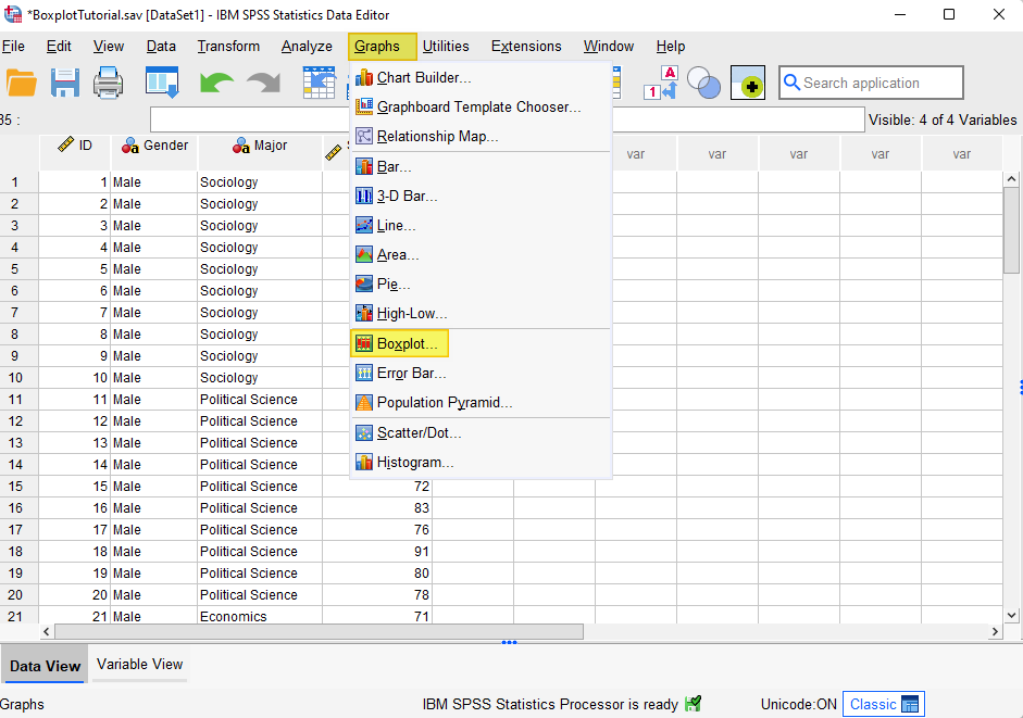
The easiest way to create side-by-side boxplots is to click Graphs -> Boxplot as illustrated below. (Note that if you are using SPSS version 28 or earlier, you will need to click Graphs -> Legacy Dialogs -> Boxplot).
This brings up the “Boxplot” dialog box below.
Select the Simple boxplot. Under “Data in Chart Are,” select Summaries for groups of cases.
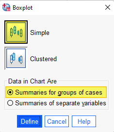
Click Define.
This brings up the “Define Simple Boxplot: Summaries for Groups of Cases” dialog box illustrated below.
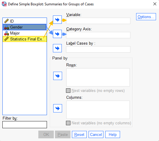
It is a good idea to click the Reset button to clear any previous settings.
Select the variable for which you wish to create boxplots (ours is “Statistics Final Exam Score”) and use the arrow button to move it into the Variable box.
Select the (categorical) variable that you want to use to group the data in your boxplots (we are using “Gender”), and use the arrow button to move it into the Category Axis box
Click OK.
The SPSS Output Viewer will pop up with the boxplots for your variable and a “Case Processing Summary.”
Data Values Visualized on Boxplots
Our boxplots of Statistics final exam scores grouped by students’ gender is illustrated below.
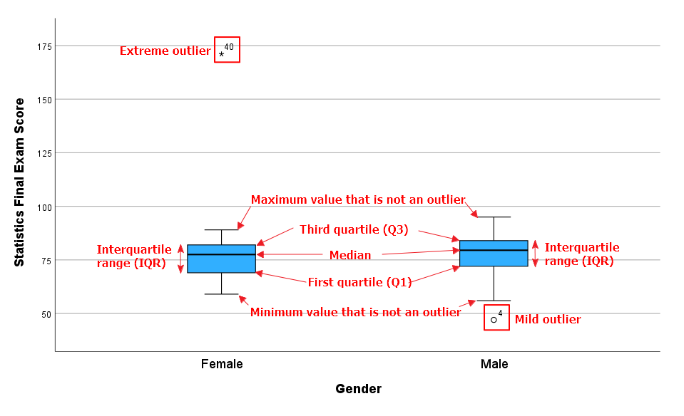
As you can see, both of our boxplots illustrate the following values for our numeric variable (Statistics final exam score):
Five Number Summary
- Minimum value that isn’t an outlier: The bottom of the vertical line (whisker) that extends from the bottom of each box.
- First Quartile (Q1): The value below which 25% of the values for each group (male and female students) are found.
- Median: The value that separates the higher half of the data set for each group from the lower half.
- Third Quartile (Q3): The value below which 75% of the values for each group are found.
- Maximum value that isn’t an outlier: The top of the vertical line (whisker) that extends from the top of each box.
- Interquartile range (IQR): The box in each boxplot. This is the middle 50% of the data set (between Q1 and Q3) for each group.
Outliers
- Mild outliers: Values that are more than 1.5 x IQR below Q1 or above Q3 are represented by circles. SPSS gives us the case numbers for these values. In our data set, case number 4 (for a male student) is a mild outlier.
- Extreme outliers: Values that are more than 3.0 x IQR below Q1 or above Q3 are represented by asterisks. In our data set, case number 40 (for a female student) is an extreme outlier.
How to Interpret and Compare Your Boxplots
Side-by-side boxplots allow us to visually compare the distribution of a numeric variable for two or more groups.
Comparing the Medians
In our example boxplots, the median Statistics final exam score is slightly higher for male students than it is for female students. We know this because the horizontal line that divides the boxes into two is higher in the boxplot for the male students than it is in the boxplot for the female students.
Comparing the Spread of Data
We can compare the spread of data between our groups (males and female students) by looking at the length of (a) the boxes and (b) the whiskers in our boxplots. Longer boxes and whiskers indicate that the data is more widely dispersed, or spread out, than shorter boxes and whiskers.
The boxes for the male and female students appear to be similar in length. That is, the interquartile ranges for male and female students appear to be similar. However, the whiskers on the boxplot for male students are longer than the whiskers on the boxplot for female students, indicating that the overall spread of Statistics final exam scores is greater for male students than it is for female students.
Comparing Skewness
When the median is in the middle of the box, and the whisker that extends from the top of the box is approximately the same length as the whisker that extends from the bottom of the box, the data set is distributed symmetrically.
When the median is closer to the bottom of the box, and the whisker below the box is shorter than the whisker above the box, the data set is positively skewed.
When the median is closer to the top of the box, and whisker above the box is shorter than the whisker below the box, then the data set is negatively skewed. In our example, the distribution of Statistics final exam scores is negatively skewed for both male and female students.
Identifying and Managing Outliers
If your data has outliers, it is a good idea to investigate them. While some outliers are legitimate, others may be the result of errors in our data. Where possible, erroneous data values should be corrected. If this is not possible, they should be removed from the data set.
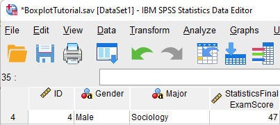
Case number 4 (for a male student) is a mild outlier in our example dataset. As illustrated below, the exam score entered for this case is 47. Without further investigation, we do not know whether this is a legitimate score.
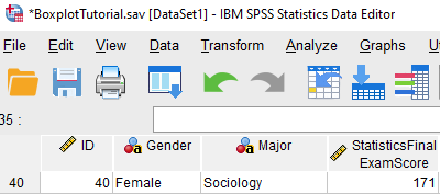
Case number 40 (for a female student) is an extreme outlier. The exam score of 171 entered for this case is clearly an error because the maximum exam score possible is 100. This score should be corrected or removed from the data set.
Saving Your Boxplots and Adding a Title
We would not want to save the boxplots illustrated in this tutorial because they include at least one erroneous data value. However, if you want to save your boxplots it is a good idea to add a title first. To do this, double-click on your boxplots in the SPSS Output Viewer to open the Chart Editor.
Then click Options-> Title as illustrated below.
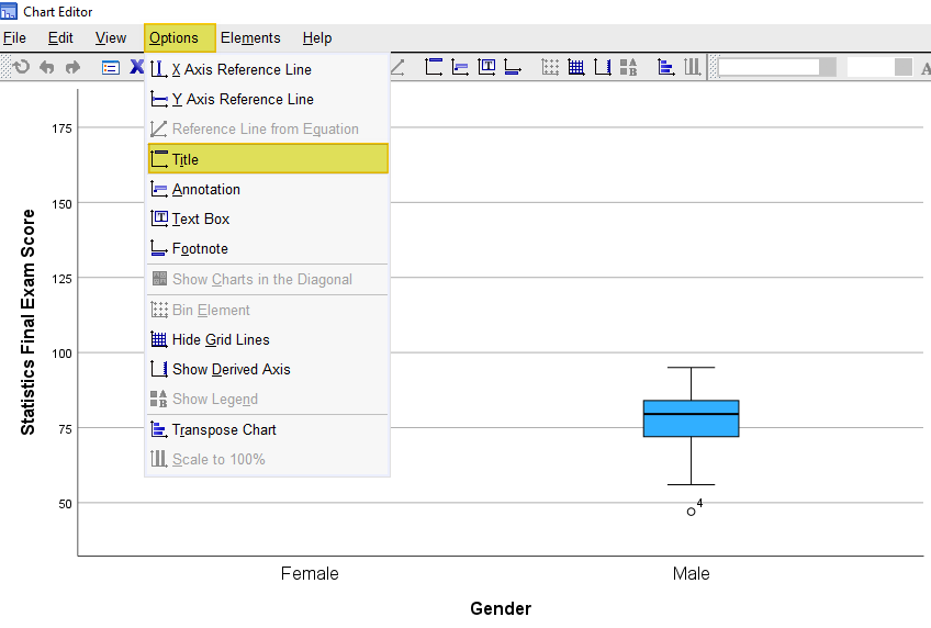
SPSS will add a title bar to your boxplots with the default text “Title.” Overtype this text with the title you want to add. Select the X in the top right corner of the Chart Editor window. Your boxplots will be saved with the title you have added.
You can then right-click on your boxplots within the Output Viewer, and copy them as an image file (which you can then use in other programs). Alternatively, check out our tutorial on exporting SPSS output to other applications such as Word, Excel, or PDF.
***************
That’s it for this quick tutorial. You should now be able to create, interpret and compare boxplots for multiple groups of a numeric variable within SPSS.
***************