In this tutorial, we show you the easiest way to create a simple line graph in SPSS.
Quick Steps
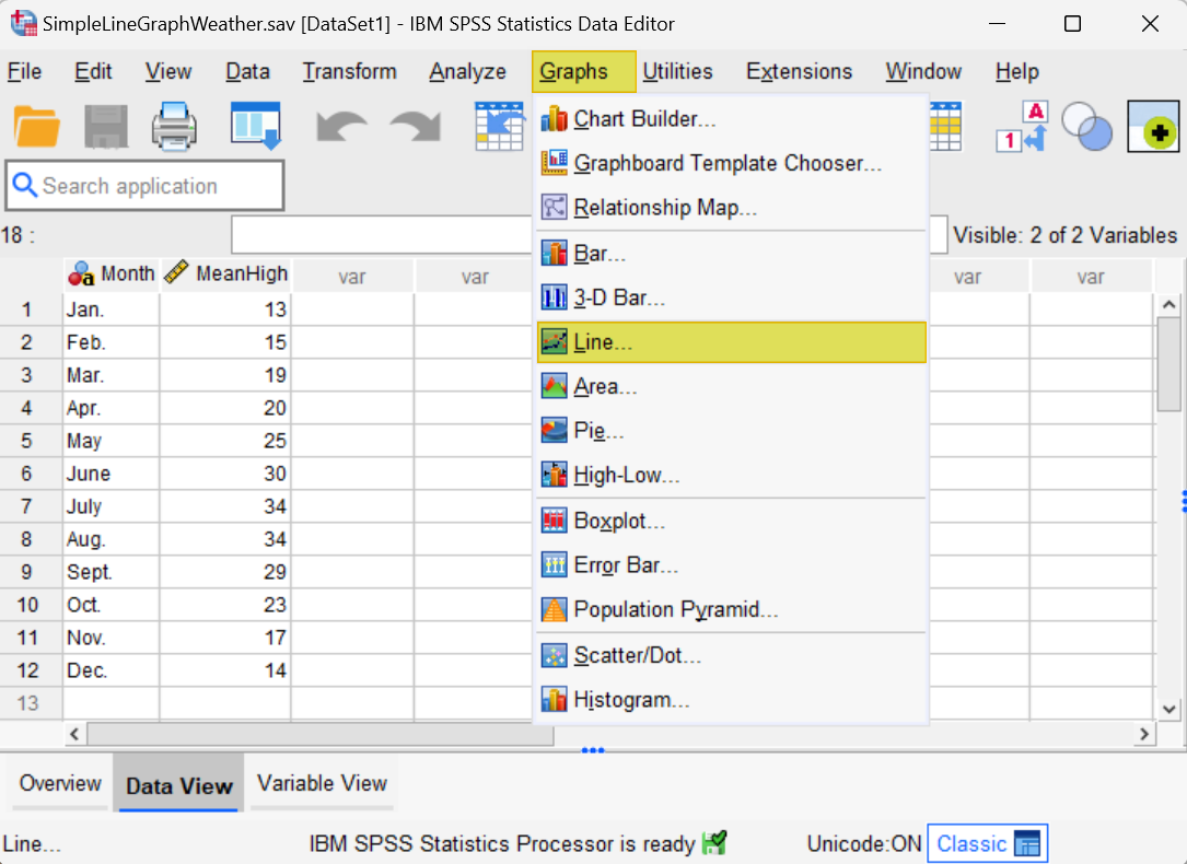
- Click Graphs -> Line (in newer versions of SPSS) OR
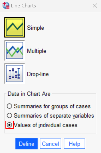
Click Graphs -> Legacy Dialogs -> Line (in older versions of SPSS) - Ensure that Simple is selected.
- Under Data in Chart Are, select Values of individual cases
- Click Define
- Click Reset (recommended)
- Move the variable that you want to appear on the Y-axis (vertical axis) to the Line Represents box
- Under Category Labels select Variable
- Move the variable that you want to appear on the X-axis (horizontal axis) to the box below Variable
- Click Titles to add a title (recommended)
- Click OK
What is a Line Graph?
A line graph uses lines to connect a series of individual data points. These data points represent a dependent numeric variable (e.g., temperature) that changes in relation to another, independent, variable (e.g., month of the year).
The dependent variable is plotted on the y axis (the vertical axis), while the independent variable is plotted on the x axis (the horizontal axis). A simple line graph is a line graph that displays only one set of data points.
Line graphs are most frequently used to visualize time series data – that is, data that changes over time. For this reason, our tutorial will focus on the steps you need to take to create a time series line graph in SPSS.
The Data
We start from the assumption that you have already imported your data into SPSS. If you haven’t done this yet, check out our tutorials on importing data from Excel or MySQL. Our data set for this tutorial contains the monthly mean high temperatures – in degrees Celsius (ºC) – for a fictitious city:
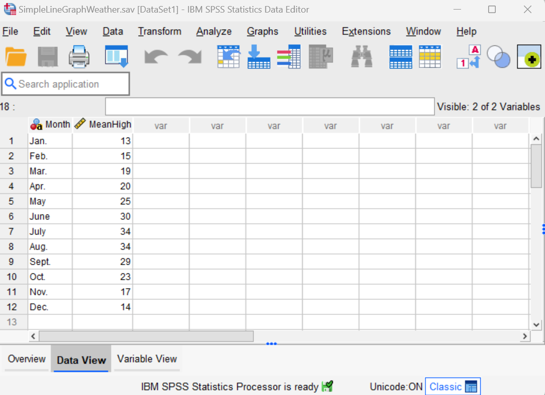
We want to create a simple line graph that plots the changes in mean high temperatures according to the month of the year in this fictitious city.
Create a Simple Line Graph
You can create a simple line graph in SPSS is as follows.
Click Graphs -> Line as illustrated below. Note, however that in older versions of SPSS, you will need to click Graphs > Legacy Dialogs -> Line:
This brings up a Line Charts dialog box.
Ensure that the Simple line chart is selected. Then, under Data in Chart Are, select Values of individual cases. Your Line Charts dialog box should now look as follows:
Click Define.
This brings up the Define Simple Line: Values of Individual Cases dialog box illustrated below. We recommend that you click the Reset button to clear any previous settings.
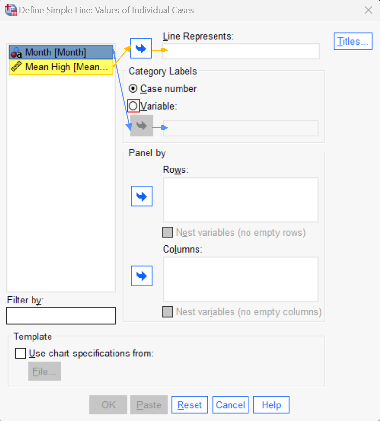
Select the variable that you want to plot on the Y-axis (i.e., the vertical axis) of your line graph, and use the arrow button to move it to the Line Represents box. This should be the dependent variable – mean high temperature in our example – and it must be numeric.
Under Category Labels, select Variable. Then, select the variable that you want to appear on the X-axis (i.e., the horizontal axis) of your line graph. This should be the independent variable – the month of the year in our example. Use the arrow button to move it to the box just below Variable.
Your Define Simple Line: Values of Individual Cases dialog box will now look something like the one below:
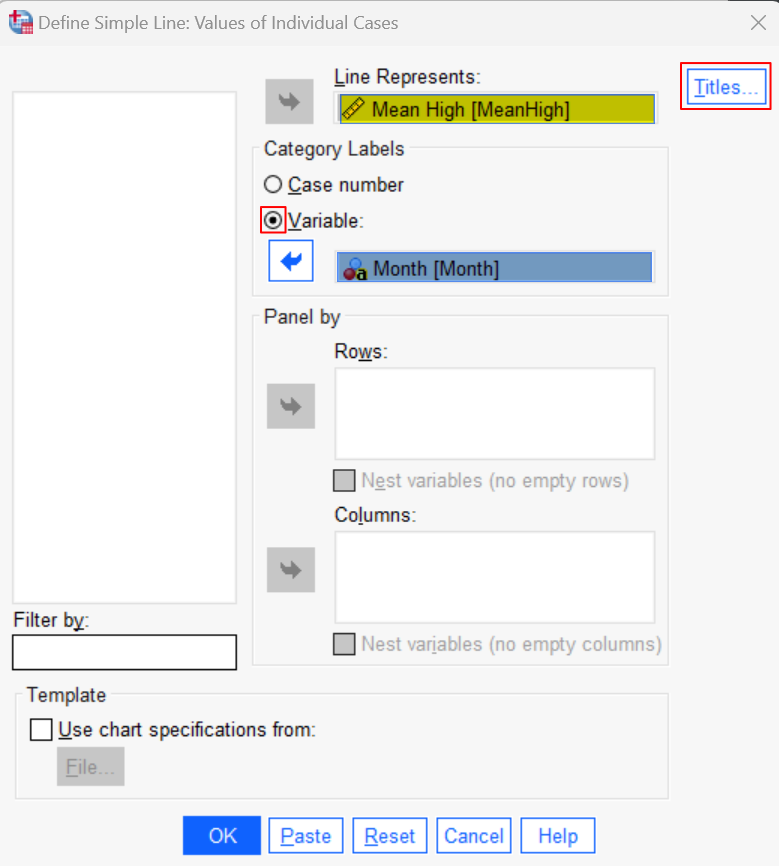
It is a good idea to add a title to your line graph. To do this, click the Titles button, type your title, and select Continue to return to the main Define Simple Line: Values of Individual Cases dialog box.
Select OK to generate your graph.
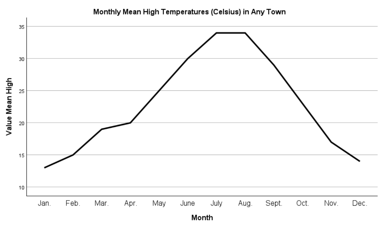
The Simple Line Graph
The SPSS Output Viewer will pop up with your line graph. Ours is illustrated below:
Editing and Saving Your Line Graph
A detailed description of all the ways in which you can edit your line graph is beyond the scope of this tutorial. However, for the graph above, we wish to adjust the Y-axis so that the temperature ranges from 0 to 40.
To edit your line graph, double-click on it in the SPSS Output Viewer to open the Chart Editor.
To adjust the scale of the Y-axis, select Edit -> Select Y Axis. This brings up the Properties dialog box as follows:
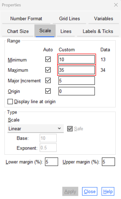
We overtype 10 with 0 in the box under Custom for Minimum. Then we overtype 35 with 40 in the Custom box for Maximum.
Select Apply to apply the changes, then select Close to close the properties dialog box.
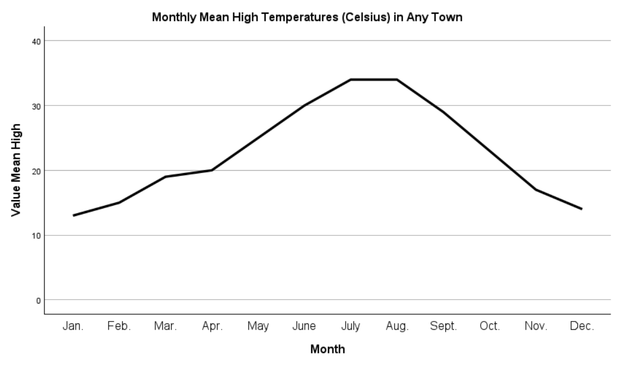
Finally, select the X at the top right corner of the Chart Editor window. Here is our edited line chart:
If you want to save your chart, you can right-click on it within the Output Viewer, and copy it as an image file, which you can then use in other programs like Microsoft Word.
***************
That’s it for this quick tutorial. You should now be able to create a simple line graph in SPSS.
***************