This quick tutorial will show you how to generate a frequency distribution table and histogram within SPSS.
Quick Steps
- Click on Analyze -> Descriptive Statistics -> Frequencies
- Move the variable of interest into the right-hand column
- Click on the Chart button, select Histograms, and the press the Continue button
- Click OK to generate a frequency distribution table
The Data
This is the data set we’ll be using.
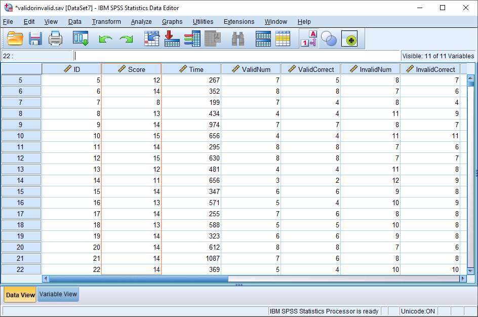
It comes from a logic test featured on the Philosophy Experiments website that requires people to identify whether arguments are valid or invalid.
We’re interested in the Score variable, which is the number of questions people get right out of 15.
A frequency distribution table provides a snapshot view of the characteristics of a data set. It allows you to see how scores are distributed across the whole set of scores – whether, for example, they are spread evenly or skew towards a particular end of the distribution.
The Frequency Distribution Table
To make a frequency distribution table, click on Analyze -> Descriptive Statistics -> Frequencies.
This will bring up the Frequencies dialog box.
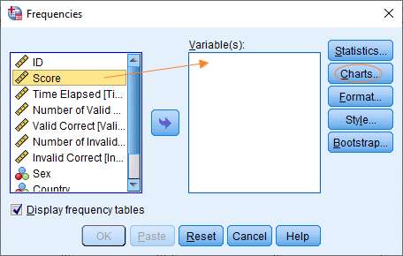
You need to get the variable for which you wish to generate the frequencies into the Variable(s) box on the right. You can do this by dragging and dropping, or by selecting the variable on the left, and then clicking the arrow in the middle.
Once you’ve set this up, hit the Charts button to bring up the Charts dialog box.
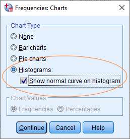
Now select Histograms as the chart type (and additionally it’s a good idea to tick the show normal curve option).
Click Continue when you’re done, which will bring you back to the Frequencies dialog box. This should look something like this.
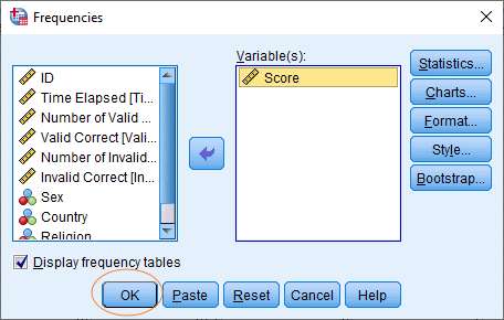
Now you’re ready to generate the frequency distribution table and histogram. Just hit the OK button.
The Result
The output produced by SPSS is fairly easy to understand.
Frequency Distribution Table
First we have the frequency distribution table:
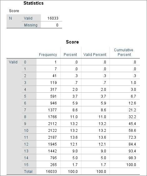
The scores (in our case, the number of correct answers) are in the left column. The number of occurrences of a given score is specified in the Frequency column.
You’ve also got columns specifying percent and cumulative percent, where percent is the number of occurrences of a given score divided by the total number of scores multiplied by 100, and cumulative percent is the total you get when you add the percent values to each other as you descend down the rows.
The size of the sample is effectively the total number of valid scores, which you can see at the top of the table and at the bottom of the Frequency column.
Histogram
A histogram provides a graphical representation of a frequency distribution.
Here’s ours.
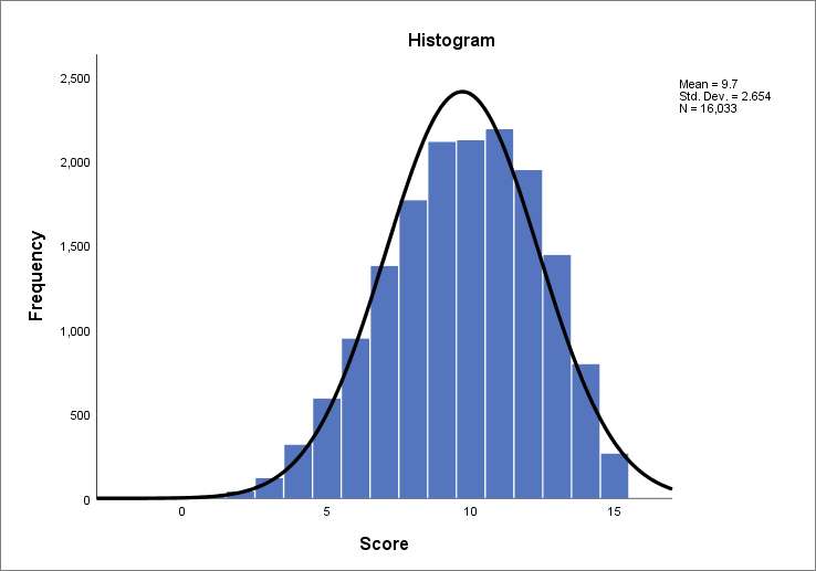
The y-axis (on the left) represents a frequency count, and the x-axis (across the bottom), the value of the variable (in this case the number of correct answers). You’ll notice that SPSS also provides values for mean (9.7) and standard deviation (2.654). It appears that our distribution is somewhat skewed to the left.
If you want to save your histogram, you can right-click on it within the output viewer, and choose to copy it to an image file (which you can then use within other programs). Alternatively, you can export your SPSS output (including your histogram and your frequency distribution table) to another application such as Word, Excel, or PDF.
***************
We hope you have found this quick tutorial useful. You should now be able to generate a frequency distribution table in SPSS and also select the histogram option.