The Pearson correlation coefficient provides a measure of the strength and direction of a liner relationship between two continuous variables.
In this tutorial, we will show you how to calculate the Pearson correlation coefficient in R, as well as how to interpret and write up the results. We will be working with RStudio, a program that makes it easier to work with R.
The Data
If you haven’t already done so, you will need to import the data for your Pearson correlation coefficient into R. We have tutorials on importing data from SPSS, Excel and CSV files into R. Alternatively, you can manually enter your data in R.
For the purposes of this tutorial, we will be using a data set that contains the SAT scores and Psychology exam scores of 40 fictitious students.
Assumptions of the Pearson Correlation Test
Before you calculate the Pearson correlation coefficient, you should ensure that your data meets the assumptions of the test.
- Both of your variables should be continuous. This means that they should be measured at the interval or ratio level.
- The relationship between your two variables should be linear.
- There should be no extreme outliers in your data since the Pearson correlation coefficient is sensitive to outliers.
- Your variables should be approximately normally distributed.
We can check assumptions 2. and 3. by visualizing the relationship between our two variables with a scatter plot. We can assess the normality of our data (assumption 4.) using a Q-Q plot and the Shapiro-Wilk test.
Visualizing the Data
We have a tutorial dedicated to creating and interpreting scatter plots in R, but, to create a basic scatter plot of the relationship between two variables including a line of best fit, we can use the following commands in RStudio.
The blue text below is what we type into the RStudio console, i.e., our commands. The pink text that starts with the character # consists of our explanations of these commands. R will ignore anything on lines that start with #.
# Load the ggplot2 package
library(ggplot2)
# Create a scatter plot with a line of best fit
ggplot(dataframe, aes(x = x, y = y)) + geom_point() + labs(title = "Title", x = "x-axis_label", y = "y-axis_label") + geom_smooth(method = "lm", se = FALSE)
Replace the highlighted text in the above command as follows:
- dataframe: the name of your data frame (sats_polsci in our example)
- x and y: the names of the two variables (vectors) (sats and polsci in our example). It doesn’t matter which variable is x and which is y.
- Title: we recommend that you add a title to your scatter plot (our title is Relationship Between SAT Scores and Political Science Exam Scores).
- x-axis_label: this labels the horizontal axis of your scatter plot (our label is SAT Scores).
- y-axis_label: this labels the vertical axis of your scatter plot (our label is Political Science Exam Scores).
So, we will enter the following to create a scatter plot for our example data:
library(ggplot2)
ggplot(sats_polsci, aes(x = sats, y = polsci)) + geom_point() + labs(title = "Relationship Between SAT Scores and Political Science Exam Scores", x = "SAT Scores", y = "Political Science Exam Scores") + geom_smooth(method = "lm", se = FALSE)
Select the enter key on your keyboard. Your scatter plot will be displayed in the Plots tab of the bottom right panel of RStudio.
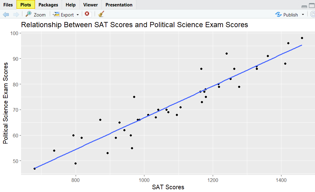
Our scatter plot shows that there is a linear relationship between our two variables, and there don’t seem to be any real outliers. So far, so good.
Assessing the Data for Normality
The final assumption that we need to check is that our data is normally distributed. We will check that both of our variables are normally distributed using Q-Q plots and the Shapiro-Wilk test as follows:
# Create a Q-Q Plot
qqnorm(dataframe$variable, main = "Title", frame = FALSE)
qqline(dataframe$variable)
# Compute the Shapiro-Wilk test
shapiro.test(dataframe$variable)
Replace the highlighted text in these commands as follows:
- dataframe: the name of your data frame (sats_polsci in our example)
- variable: one of the the variables (vectors) in this data frame that you are testing for normality – note that you will need to test both variables (sats and polsci in our example).
- Title: the title of your Q-Q plot. We recommend adding a custom title to your plot (e.g., Normal Q-Q- Plot for VariableName) so that you know which plot represents each of the two variables
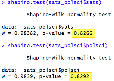
So, to create Q-Q plots and calculate the Shapiro-Wilk test for the sats and the polsci variables, we type the following in the RStudio console:
qqnorm(sats_polsci$sats, main = "Normal Q-Q Plot for SAT Scores", frame = FALSE)
qqline(sats_polsci$sats)
qqnorm(sats_polsci$polsci, main = "Normal Q-Q Plot for Political Science Exam Scores", frame = FALSE)
qqline(sats_polsci$polsci)
shapiro.test(sats_polsci$sats)
shapiro.test(sats_polsci$polsci)
Then we select enter on our keyboard to execute these commands.
The two Q-Q plots will be displayed in the Plots tab of the bottom right panel of RStudio. You will need to use the arrow button (highlighted below) to toggle between these two plots.
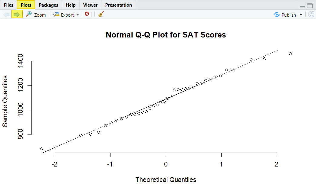
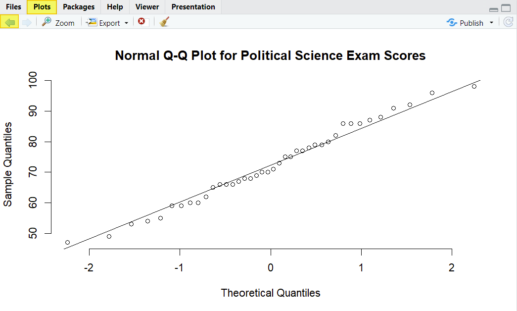
The data points fall close to the diagonal line for both of our variables, indicating that they are normally distributed. In addition, the p-value of the Shapiro-Wilk normality test for both of our variables is greater than .05, as per the screenshot below. We therefore assume that the both of our variables are normally distributed.
Calculating the Pearson Correlation Coefficient in R
Once we know that our data meets the test assumptions, we can go ahead and calculate the Pearson correlation coefficient. We simply enter the following command in the RStudio console and then select enter on our keyboard:
# Calculate the Pearson correlation coefficient
cor.test(x = dataframe$x, y = dataframe$y, method=c("pearson"))
Replace the highlighted text above as follows:
- dataframe: the name of your data frame in RStudio (sats_polsci in our example)
- x and y: the two variables (vectors) for which you are calculating the Pearson correlation coefficient (sats and polsci in our example). It doesn’t matter which of the two variables is x and which is y.
We enter the following for our example:
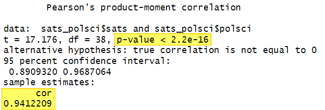
cor.test(x = sats_polsci$sats, y = sats_polsci$polsci, method=c("pearson"))
Select enter on your keyboard to execute the command. Here is the output for our example in RStudio:
Interpreting the Pearson Correlation Test in R
The most important values in the Pearson correlation output are the correlation coefficient (cor) and the significance value (p-value)
Pearson Correlation Coefficient, r
The Pearson correlation coefficient, which is represented by the letter r, is a measure of the strength and direction of the relationship between our two variables. r can take any value between -1 and +1.
Positive values indicate that, as the value of one variable increases, the value of the other variable increases too. Negative values indicate that, as the value of one variable increases, the value of the other variable decreases. A value of 0 means that there is no linear relationship between the two variables.
Several different sets of guidelines have been developed to help us interpret the strength of the relationship between the two variables, one of which is presented below:
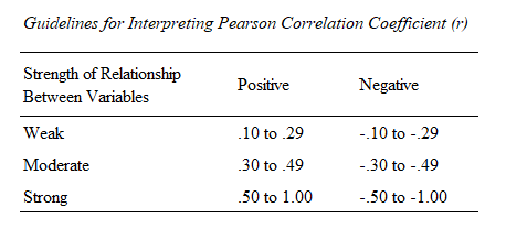
Using this table, our correlation coefficient of 0.9412209 represents a (very) strong positive relationship between our two variables.
It is important to note that a correlation between your variables does not necessarily mean that there is a causal relationship between them.
p Value
The other important value in the output is the significance value (p-value) of the test. The p-value for our example is < 2.2e-16. That is, our p value is less than 2.2 x 10⁻¹⁶ or < .00000000000000022. Since this is much lower than the significance levels of .05 of .01 that are typically used for hypothesis testing, we conclude that our result is statistically significant. This very low p-value can be reported as < .001
Reporting the Pearson Correlation
You can report this result in APA Style as follows:
A Pearson correlation coefficient was calculated to assess the relationship between students’ SAT scores and their Psychology exam scores. There was a significant strong positive relationship between SAT scores and Psychology exam scores, r(38) = .94, p = < .001.
Note: the value of 38 in parentheses after r represents the degrees of freedom (df) for our test – this value is included in the RStudio output above.
***************
That’s it for this tutorial. You should now be able to calculate the Pearson correlation coefficient in R, and interpret and write up the results of your test.
***************