Boxplots are graphs that can help us to visualize the distribution of numeric data, and to identify outliers. They can be especially useful when we want to compare the distribution of numeric variables between different groups, for example, we can use them to compare the distribution of exam scores for male and female students.
In this tutorial, we will show you how to create and interpret boxplots in R. We will be working with RStudio, a program that makes it easier to work with R.
The Data
The first step is to create or import a data frame in R. This should contain the numeric variable(s) for which you want to create a boxplot. If you want to compare this variable across groups (e.g., gender), the data frame should also include this grouping variable.
If you need help with this step, please see our tutorials on importing SPSS, Excel and CSV files into R, or our tutorial on manually entering data in R.
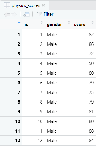
Our example data frame contains the Physics exam scores and gender of 40 fictitious students.
We will create boxplots so that we can:
- Visually compare the way these exam scores are distributed for male and female students.
- Determine whether there are any outliers in the exam scores of either group.
Install and Load ggplot2
We recommend using the ggplot2 visualization package to create boxplots in RStudio. If you haven’t already done so, you can install this package by typing the following command and then selecting the enter key on your keyboard:
install.packages("ggplot2")
Then, we need to load this package by typing the following command and selecting enter on our keyboard:
library(ggplot2)
Creating Boxplots in R
To create boxplots grouped by a categorical variable (e.g., gender), enter the following command in the RStudio console and then select enter on your keyboard:
ggplot(dataframe, aes(x = x, y = y, fill = x)) + geom_boxplot() + labs(title = "Title")
Replace the highlighted text to create your own grouped boxplots as follows:
- dataframe: the name of your data frame in RStudio (physics_scores in our example).
- x: the name of the grouping variable (vector) for your boxplots (gender in our example)
- y: the name of the numeric variable (vector) for which you wish to create boxplots (score in our example).
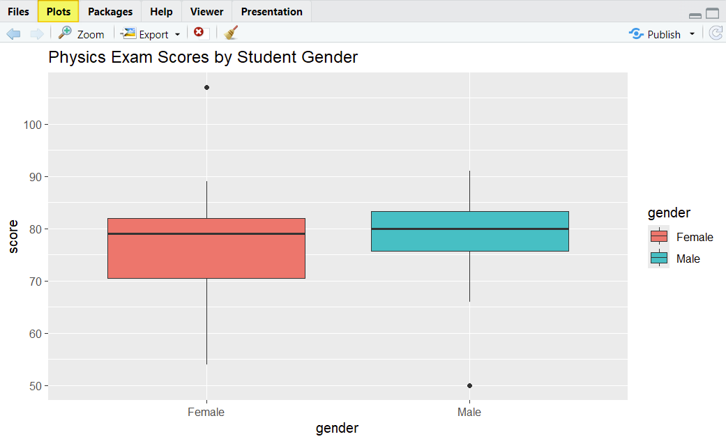
- Title: we recommend adding a title to your boxplot. Ours is Physics Exam Scores by Student Gender
The command that we use to generate boxplots for our example is:
ggplot(physics_scores, aes(x = gender, y = score, fill = gender)) + geom_boxplot() + labs(title = "Physics Exam Scores by Student Gender")
Once you select the enter key on your keyboard, R will create your boxplots and display them in the Plots tab of the bottom right panel of RStudio as illustrated below.
Note: to create a green boxplot for the Physics exam scores that is not grouped by gender, we would use the following command:
ggplot(physics_scores, aes(y = score)) + geom_boxplot(fill = "green") + labs(title = "Physics Exam Scores")
Of course, you can replace green with your preferred fill color.
Reading Boxplots
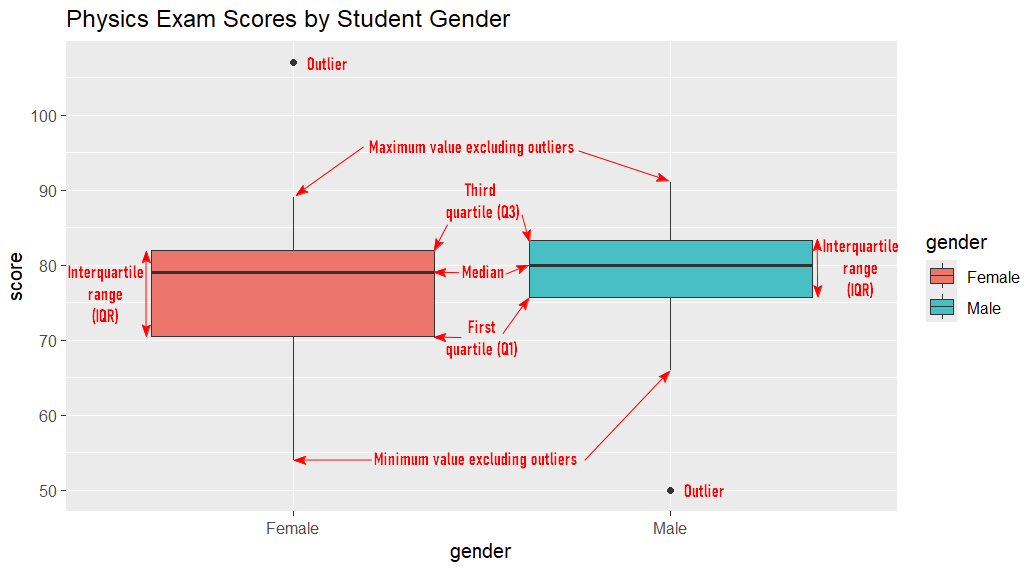
As you can see, boxplots visualize some important information about numeric variables (students’ Physics exam scores in our example).
The Five Number Summary
Boxplots illustrate the five number summary:
- Median: The value that separates the higher and lower halves of the values for each group.
- First Quartile (Q1): The value below which 25% of the values are found for each group.
- Third Quartile (Q3): The value below which 75% of the values are found for each group.
- Interquartile range (IQR): The box part of the boxplot. It represents the middle 50% of the values (between Q1 and Q3) for each group.
- Minimum value excluding outliers: The bottom of the vertical lines (whiskers) that extend from the bottom of the boxes.
- Maximum value excluding outliers: The top of the vertical lines (whiskers) that extend from the top of the boxes.
Outliers
Boxplots also show us any outliers that may be present in our data – these are the black dots in the screenshot above. Outliers are values that are more than 1.5 x the IQR below Q1 or above Q3.
Interpreting and Comparing Boxplots
Boxplots allow us to review and compare the medians, data spread, skewness and outliers of our data.
Medians
The median is a measure of central tendency. In our example, the median Physics exam score for male students is a slightly higher than that for female students, but there isn’t much difference between the two groups on this measure.
Data Spread
Boxplots allow us to compare the spread, or variability, of data between groups. Longer boxes and whiskers indicate that data is more spread out than shorter boxes and whiskers.
In our example, the box for female students is longer than that for male students, indicating that the Physics exam scores are more spread out for the females. Although the top whiskers are similar for the two groups, the bottom whisker is longer for the female group, also indicating that the scores are more spread out for the female students than for their male counterparts.
Skewness
Boxplots also tell us whether the distribution of our data is symmetric or skewed.
- Symmetrically distributed data: the median is roughly in the middle of the box, and the whiskers that extend from the top and bottom of the box are approximately the same length.
- Positively skewed data: the median is closer to the bottom of the box, and the whisker above the box is longer than the one below it.
- Negatively skewed data: the median is closer to the top of the box, and the whisker below the box is longer than the one above it.
For our female students, the median is closer to the top of the box, and the whisker below the box is longer than the one above it, indicating that the distribution of their scores is negatively skewed.
For our male students, the median is more or less in the middle of the box, and the top and bottom whiskers are similar in length, indicating that their scores are distributed symmetrically.
Outliers
There are two outliers in our example. The score for one of the female students is more than 100 which must be an error because the maximum possible score for the exam is 100. We should correct this value or remove it from the data frame.
In addition, the score of one of the male students is 50. Unlike the other outlier, this score is feasible. If possible, we should investigate this score to determine whether it is legitimate. If it isn’t legitimate, we should correct it or remove it.
Saving Boxplots as Images (Optional)
If you want to save your boxplots as images, you can do so as follows.
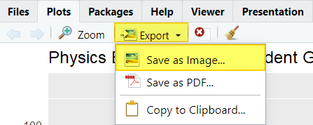
In the Plots tab of the bottom right panel in RStudio, click Export and Save as Image…
You will then see the Save Plot as Image window below:
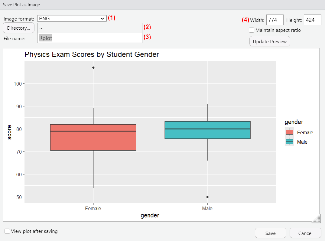
(1) Select the image format in which you want to save your file.
(2) To select the folder where you want to save your image file, click the Directory… button and navigate to that folder. Once you have located it, click the Open button there.
(3) Replace Rplot with the name of your image file.
(4) Modify the size of your image here if needed.
Click Save to save your image.
***************
That’s it for this tutorial. You should now be able to create, interpret and compare boxplots in R.
***************