Histograms allow us to visualize the distribution of quantitative variables like exam scores.
In this tutorial we will show you how to create and customize a histogram in R using the the ggplot2 visualization package. We will be working in RStudio, a program that makes it easier to work with R.
Install and Load ggplot2
Since the ggplot2 package isn’t automatically installed with R, the first step is to install it (if you haven’t yet done so). You can install the complete set of tidyverse packages, which includes ggplot2, by typing the following command in the RStudio console:
install.packages("tidyverse")
Alternatively, you can install the ggplot2 package only using the following command:
install.packages("ggplot2")
Select the enter key on your keyboard to complete the installation.
We also need to load the ggplot2 package before we can use it in R. To do this, we type the following command and then selecting enter on our keyboard:
library(ggplot2)
The Data
Before we can create a histogram in R, we need to either manually enter the data for our quantitative variable or import it into R from another file type such as SPSS, Excel or CSV.
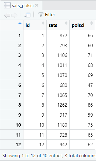
Here, we will be working with a data frame called sats_polsci. It contains the SAT scores and Political Science exam scores of 40 students from a fictitious study. We want to create a histogram to visualize the distribution of the Political Science exam scores.
Creating a Histogram in R
Enter the following command in the RStudio console and then click the enter key on your keyboard to create a histogram with a title and axes labels:
ggplot(dataframe, aes(x = x)) + geom_histogram() + labs(title = "Title", x = "x-axis_label", y = "Frequency")
Replace the highlighted text with the relevant information for your own histogram as explained below:
- dataframe: the name of your data frame in R (sats_polsci in our example)
- x: the name of the variable in this dataframe that you want to plot (polsci in our example)
- Title: it is good practice to give your histogram a title
- x-axis_label: the name of the variable that you are plotting (Political Science exam scores in our example). This will be displayed on the horizontal axis of your histogram.
The command that we use to generate our example histogram is:
ggplot (sats_polsci, aes(x = polsci)) + geom_histogram() + labs(title = "Histogram of Political Science Exam Scores", x = "Political Science Exam Scores", y = "Frequency")
Click the enter key on your keyboard. Your histogram will appear in the Plots tab of the bottom right panel of RStudio.
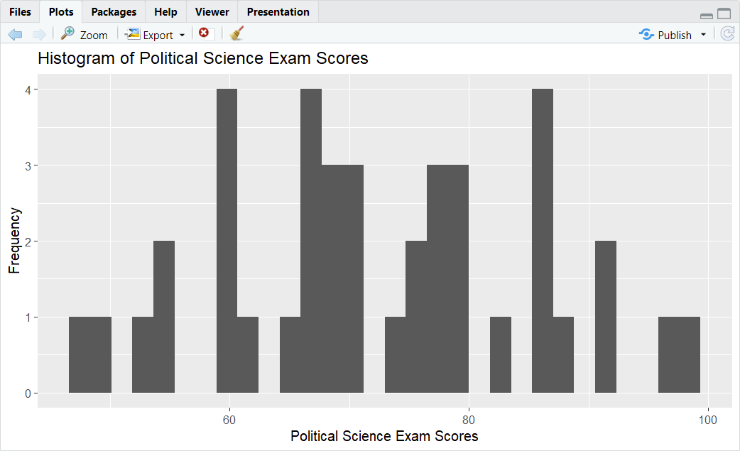
It is quite likely that you will see a message saying: `stat_bin()` using `bins = 30`. Pick better value with `binwidth`
As you can see, the histogram produced by R needs some work! In other words, we need to customize it.
Customizing Your Histogram in R
Remember that the goal of histograms and other charts is to present your data as clearly and effectively as possible. With that in mind, let’s look at some of the most useful ways to customize histograms in R.
Modifying the Bins of a Histogram
The first aspect of our histogram that we are going to modify is the bins.
The bins are the bars of the histogram. Each bin represents a range of values for the variable that we are plotting (Political Science exam scores in our example). The height of each bin or bar tells us how many of the values or data points from our variable fall within that range.
By default, the histograms that we create with the ggplot2 package in R have 30 bins. However, most histograms are easier to interpret with a smaller number of bins.
There are a couple of approaches to modifying the bins of a histogram. We can determine either the number of bins that we want to display or the width of those bins.
Setting the Number of Bins
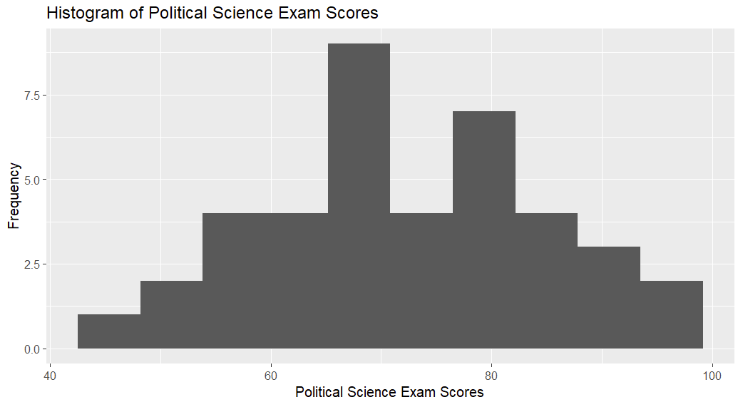
To set the number of bins, we use the bins argument of the geom_histogram() function. For example, if we wanted to modify the histogram above so that it had only 10 bins, we would use the following command:
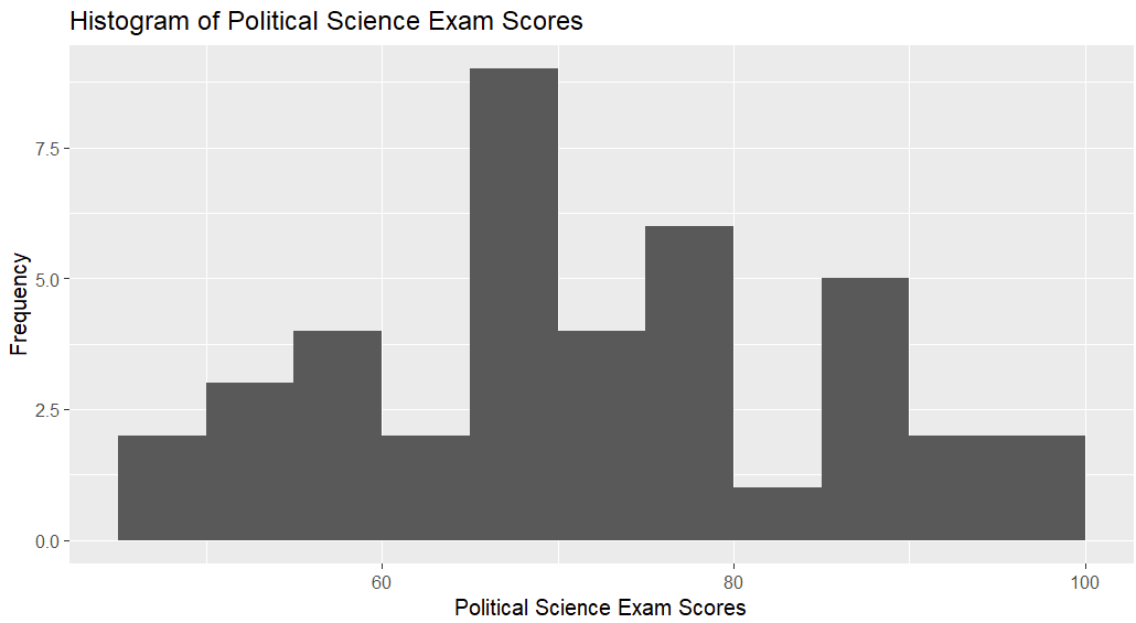
ggplot (sats_polsci, aes(x = polsci)) + geom_histogram(bins = 10) + labs(title = "Histogram of Political Science Exam Scores", x = "Political Science Exam Scores", y = "Frequency")
With 10 bins instead of 30, it is somewhat easier to get a sense of the spread of our exam score data:
Setting the Bin Width
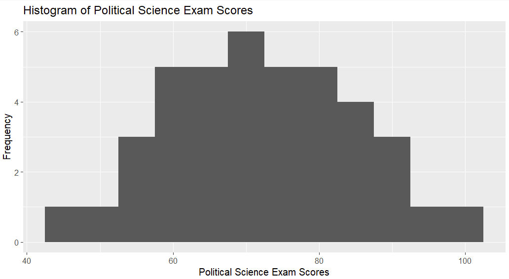
The other approach is to set the width of our bins by using the binwidth argument of the geom_histogram() function. For example, if we want each bin of our histogram to represent a range of 5 marks on the Political Science exam, we would type the following command into RStudio:
ggplot (sats_polsci, aes(x = polsci)) + geom_histogram(binwidth = 5) + labs(title = "Histogram of Political Science Exam Scores", x = "Political Science Exam Scores", y = "Frequency")
Sometimes it can be useful to use the boundary argument with the binwidth argument. This allows us to control the boundaries (as well as the width) of our bins. For example, if we want to set the boundaries of the bins in the above histogram at multiples of 10 (50, 60, 70, etc.), we can modify the command for our histogram to read as follows:
ggplot (sats_polsci, aes(x = polsci)) + geom_histogram(binwidth = 5, boundary = 10) + labs(title = "Histogram of Political Science Exam Scores", x = "Political Science Exam Scores", y = "Frequency")
It is a good idea to experiment with the number and/or width of bins you use for your histogram.
Modifying the Color and Style of Your Histogram
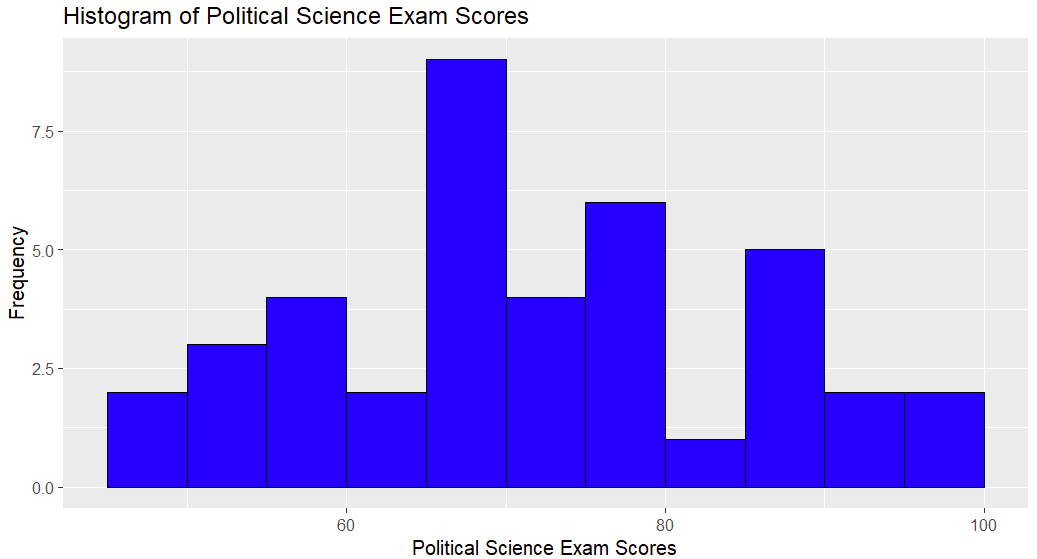
You can modify the color of the bins and their outlines using the fill and color arguments of the geom_histogram() function. For example, to get blue bins with black outlines, we can use fill="blue", color="black". Adding this to the command we used to create the last version of the histogram, we get:
ggplot (sats_polsci, aes(x = polsci)) + geom_histogram(binwidth = 5, boundary = 10, fill="blue", color="black") + labs(title = "Histogram of Political Science Exam Scores", x = "Political Science Exam Scores", y = "Frequency")
Modify the Minimum and Maximum Values of the Axes
You can modify the minimum and maximum values of your histogram axes. You will need to ensure that both the x-axis and y-axis cover the full range of data values:
+ xlim (xmin, xmax) + ylim (ymin, ymax)
Replace the highlighted text with the appropriate values for your histogram:
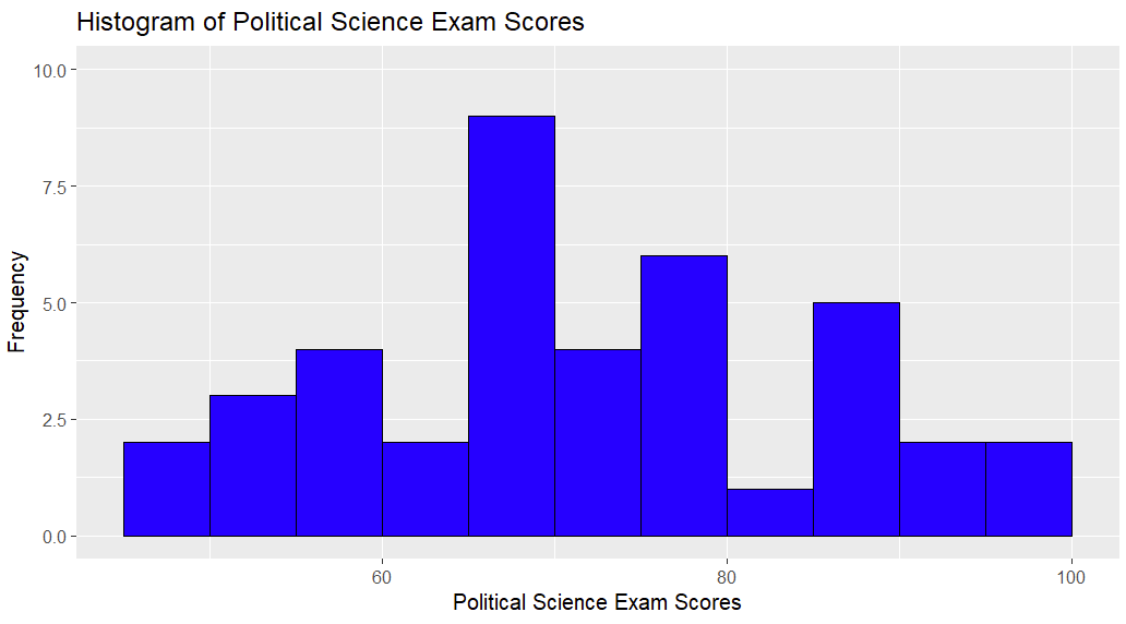
- xmin and xmax set the minimum and maximum values of the (horizontal) x-axis. This axis displays the Political Science exam scores of our fictitious students. We are not going to change these.
- ymin and ymax set the minimum and maximum values of the (vertical) y-axis. This tells us the number of students with Political Science exam scores in each bin or range of values. We want to add slightly more space above the histogram bars so will set these values to 0 and 10 respectively.
To do this, we will add the following to the command we entered in RStudio before:
+ ylim (0, 10)
Putting this together, we have:
ggplot (sats_polsci, aes(x = polsci)) + geom_histogram(binwidth = 5, boundary = 10, fill="blue", color="black") + labs(title = "Histogram of Political Science Exam Scores", x = "Political Science Exam Scores", y = "Frequency") + ylim (0, 10)
Here is our updated histogram:
Modify Gridline Intervals on Your Histogram
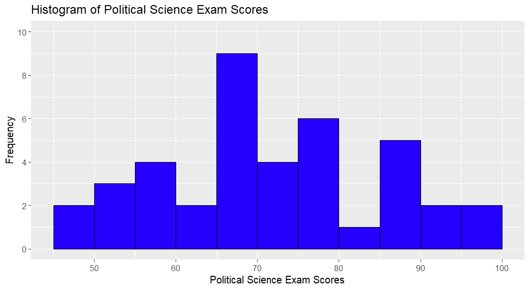
We can also modify the gridline intervals of a histogram. For example, we would like to include vertical gridlines at 10% intervals for students’ Political Science exam scores. We can set vertical gridlines with the breaks argument of the scale_x_continuous function.
To set our vertical gridlines at 10% intervals between 0 and 100, we use the following command (R will adjust to the fact that the lowest value in our data set is actually 47):
+ scale_x_continuous(breaks = seq(0, 100, by = 10))
We also want to set our horizontal gridline intervals at every 2 (students’ scores) so that it is easier to read our histogram. We can do this with with the breaks argument of the scale_y_continuous function.
Note, however, that we cannot combine the scale_y_continuous function with the ylim function that we used in the previous section of this tutorial. To set the minimum and maximum values of our y-axis as well as setting the horizontal gridlines, we need to remove the ylim function from our command. Then we use the limits and breaks arguments in the scale_y_continuous function to set the maximum/values axis value and gridlines respectively.
So we will remove:
+ ylim (0, 10)
… and replace it with:
+ scale_y_continuous(limits = c(0, 10), breaks=seq(0, 10, by = 2))
Putting this all together, the updated command for our histogram is:
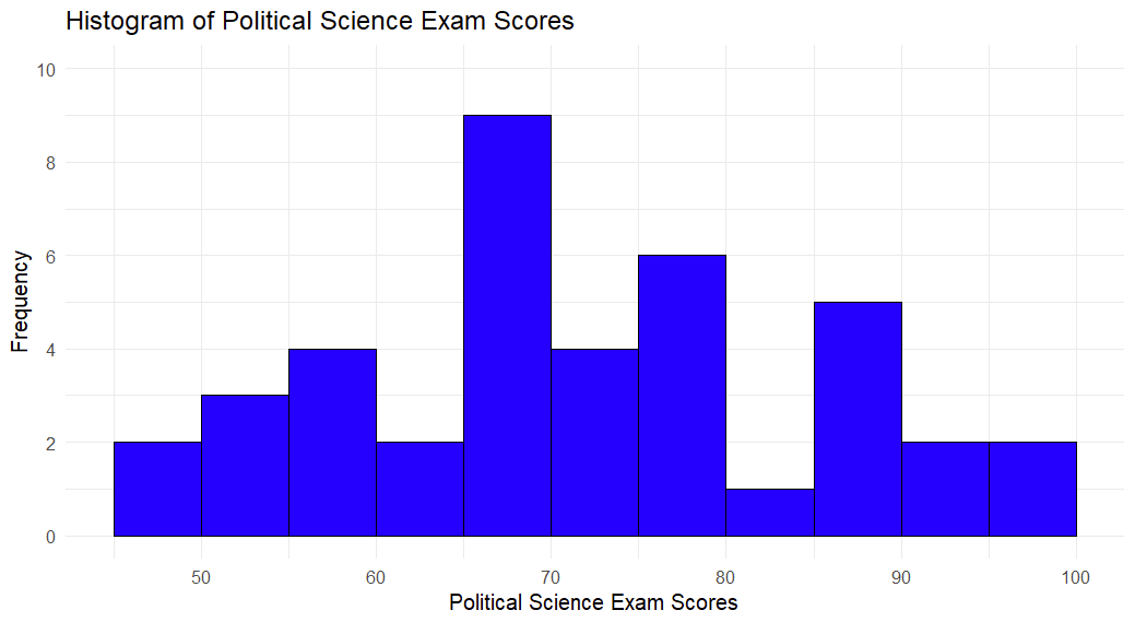
ggplot (sats_polsci, aes(x = polsci)) + geom_histogram(binwidth = 5, boundary = 10, fill="blue", color="black") + labs(title = "Histogram of Political Science Exam Scores", x = "Political Science Exam Scores", y = "Frequency") + scale_x_continuous(breaks = seq(0, 100, by = 10)) + scale_y_continuous(limits = c(0, 10), breaks=seq(0, 10, by = 2))
With this command, we get the following histogram:
Applying a Theme to Your Histogram
Finally, you can apply one of the ggplot themes to your histogram. We will apply theme_minimal to our histogram as follows:
ggplot (sats_polsci, aes(x = polsci)) + geom_histogram(binwidth = 5, boundary = 10, fill="blue", color="black") + labs(title = "Histogram of Political Science Exam Scores", x = "Political Science Exam Scores", y = "Frequency") + scale_x_continuous(breaks = seq(0, 100, by = 10)) + scale_y_continuous(limits = c(0, 10), breaks=seq(0, 10, by = 2)) + theme_minimal()
Saving Your Histogram as an Image (Optional)
If you want to save your histogram as an image file, you can do so using the following steps.
From the Plots tab of the bottom right panel of RStudio, click Export and Save as Image…
This brings up the Save Plot as Image window:
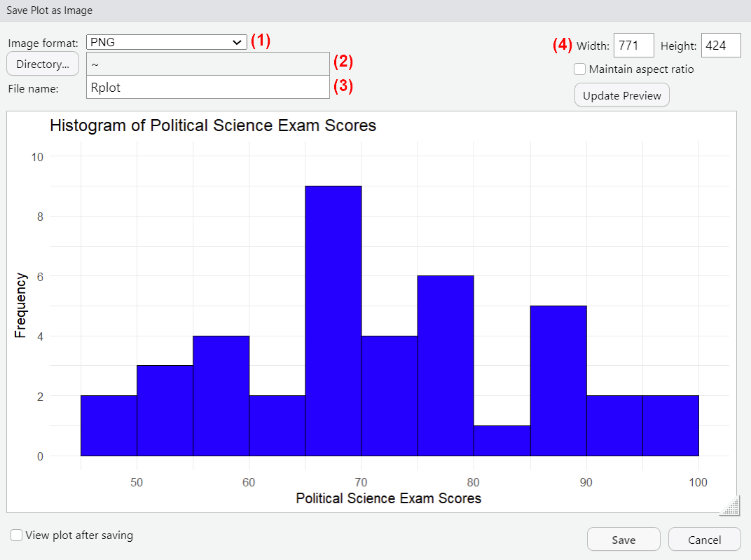
(1) Select the desired image format for your histogram file.
(2) Click Directory… and browse to the folder where you want to save your file. Once you have navigated to this folder, click the Open button.
(3) Overtype Rplot with the name that you want to give to your histogram image file.
(4) Modify the size of your image if desired.
Click Save.
***************
That’s it for this tutorial. You should now be able to create and customize a histogram in R using the ggplot2 visualization package.
***************