Scatter plots give us a helpful way of visualizing the relationship between two numeric variables. In this tutorial, we will show you how to create a scatter plot in R using RStudio, a program that makes it easier to work with R.
Install ggplot2
The best way to create a scatter plot in RStudio is to use the ggplot2 visualization package. This package does not come pre-installed with R, so you will need to install it if you haven’t already done so. Our recommendation is to install the complete set of tidyverse packages, which includes ggplot2, by typing the following command in the RStudio console:
install.packages("tidyverse")
However, you can also opt to install ggplot2 only using the following command:
install.packages("ggplot2")
Select the enter key on your keyboard to complete the installation.
We also need to load the ggplot2 package before we can start to work with it in R. Do this by typing the following command and then selecting enter on your keyboard:
library(ggplot2)
The Data
We start this tutorial from the assumption that you have already created or imported a data frame in R containing the two numeric variables for your scatter plot. Please feel free to check out our tutorials on importing SPSS, Excel and CSV files into R, or our tutorial on manually entering data in R.
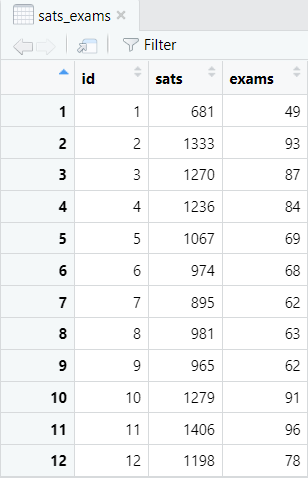
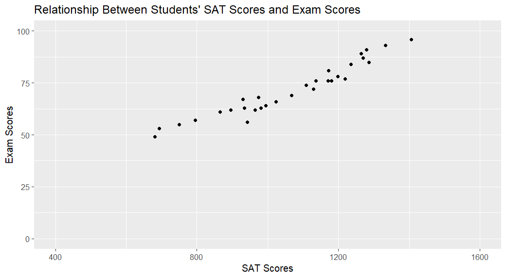
Here, we will work with a data frame called sats_exams. It contains the SAT scores and exam scores of 30 students from a fictitious study – the first 12 records of this data frame are displayed below.
We want to create a scatter plot to visualize the relationship between the students’ SAT scores and their exam scores.
Creating a Scatter Plot in R
Enter the following command in the RStudio console and then select enter on your keyboard to create a scatter plot in R with a title and axes labels:
ggplot(dataframe, aes(x = x, y = y)) + geom_point() + labs(title = "Title", x = "x-axis_label", y = "y-axis_label")
Replace the highlighted text with the relevant information for your own scatter plot as explained below:
- dataframe: the name of your data frame in RStudio. In our example this is sats_exams
- x and y: the names of the two variables (vectors) that you want to plot. If your data comes from a regression study, x is the predictor/independent variable and y is the criterion/dependent variable. If there are no obvious independent and dependent variables, it doesn’t matter which one is x and which one is y. We hypothesize that sat scores may predict exam scores so sats is the x variable and exams is the y variable
- Title: we recommend that you add a title to your scatter plot.
- x-axis_label: this will appear on the horizontal axis of your scatter plot.
- y-axis_label: this will appear on the vertical axis of your scatter plot.
The command that we use to generate a scatter plot for our example is:
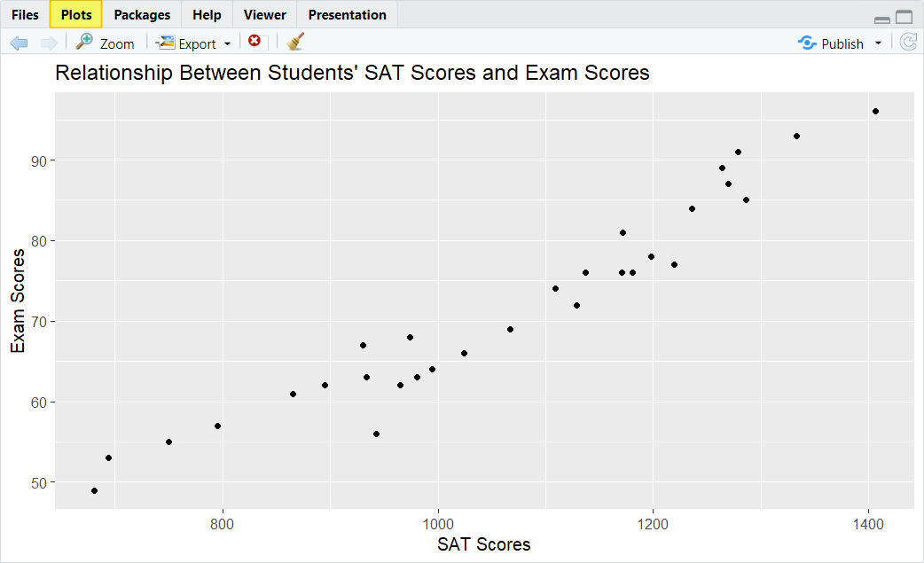
ggplot(sats_exams, aes(x = sats, y = exams)) + geom_point() + labs(title = "Relationship Between Students’ SAT Scores and Exam Scores", x = "SAT Scores", y = "Exam Scores")
Once you select the enter key on your keyboard, R will generate your scatter plot and display it in the Plots tab of the bottom right panel of RStudio.
Interpreting a Scatter Plot
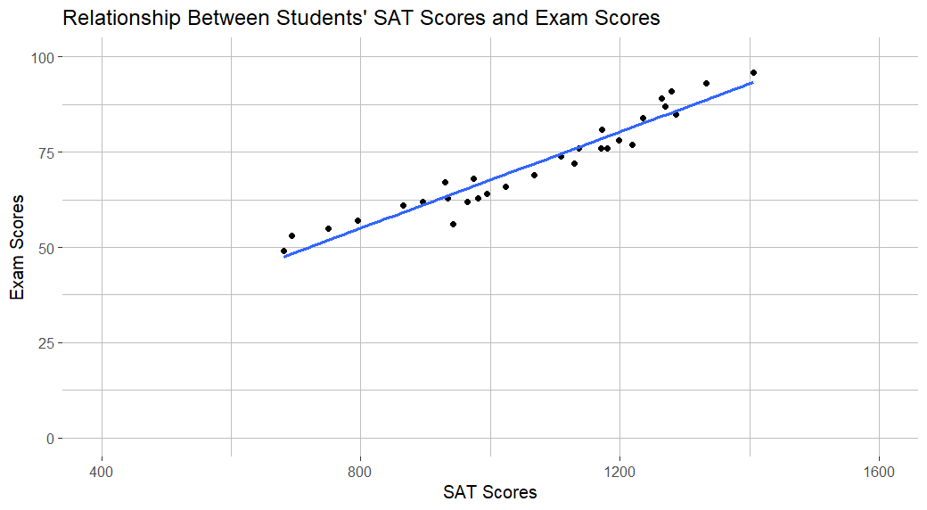
Each dot on our scatter plot represents one of the students in our fictitious study. The position of each dot on the (horizontal) x-axis indicates the SAT score of one student, while it’s position on the (vertical) y-axis indicates the exam score of the same student. The scatter plot for our fictitious study indicates that there is a positive linear relationship between students’ SAT scores and their exam scores. That is, students with lower SAT scores tend to have lower exam scores, and students with higher SAT scores tend to have higher exam scores.
It is important to note that scatter plots cannot prove causal relationship between variables. In other words, our scatter plot does not prove that high SAT scores cause high exam scores.
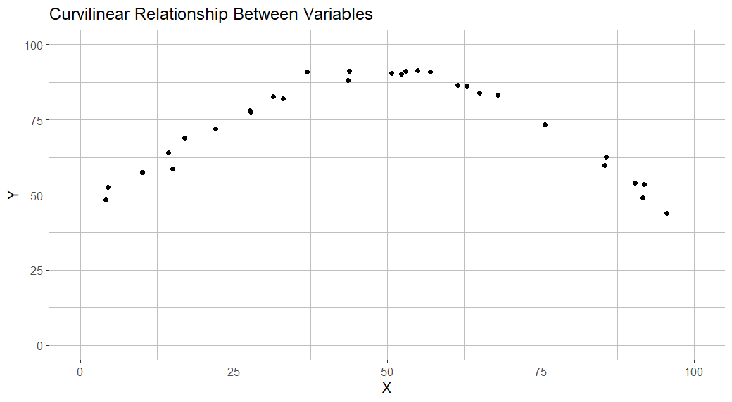
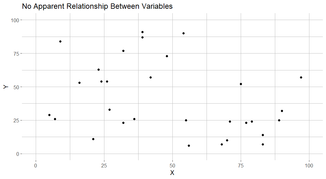
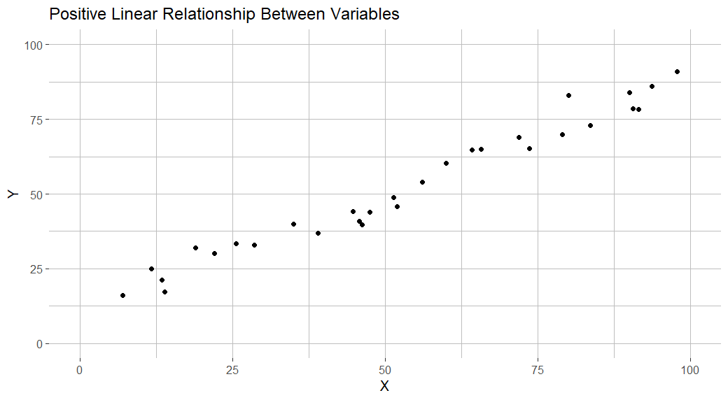
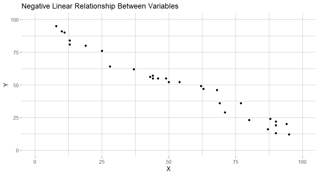
The positive linear relationship that we observed in our scatter plot is only one of several possible relationship between variables. Some of the relationships that your scatter plot may indicate are illustrated below.
|
|
|
 |
 |
Formatting a Scatter Plot in R
There are lots of ways in which you can format your scatter plot in R. In this section, we describe some of the most useful formatting options.
Set the Minimum and Maximum Values of the Axes
You can set the minimum and maximum values of the x-axis and y-axis of your scatter plot as outlined below. However, it is important to ensure that both axes cover the full range of values in your data:
+ xlim (xmin, xmax) + ylim (ymin, ymax)
Replace the highlighted text with the relevant values for your own scatter plot as described below:
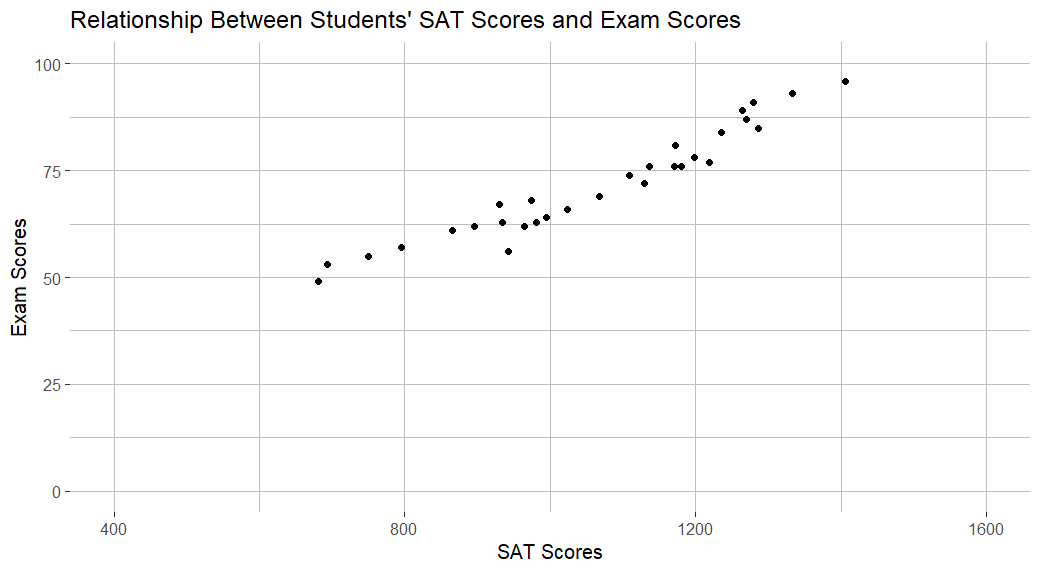
- xmin and xmax set the minimum and maximum values of the x-axis. The x-axis in our scatter plot represents the SAT scores of our fictitious students. We will set these values to the minimum and maximum SAT scores that a student can achieve, that is, 400 and 1600 respectively
- ymin and ymax set the minimum and maximum values of the y-axis. We will set these values to 0 and 100 respectively, the minimum and maximum scores that our fictitious students can score on their exam.
So, for our example, we would add the following to the command we entered in RStudio before:
+ xlim (400, 1600) + ylim (0, 100)
Putting this together, we have:
ggplot(sats_exams, aes(x = sats, y = exams)) + geom_point() + labs(title = "Relationship Between Students’ SAT Scores and Exam Scores", x = "SAT Scores", y = "Exam Scores") + xlim (400, 1600) + ylim (0, 100)
Our updated scatter plot is as per the screenshot below:
Change the Color of the Background and Gridlines
You may also wish to change the color of the background the gridlines on your scatter plot to make it easier to read. You can do this, by adding the following to the command we used earlier:
+ theme( panel.background = element_rect(fill = "panel", color = NA), plot.background = element_rect(fill = "plot", color = NA), panel.grid.major = element_line(color = "majorgrid"), panel.grid.minor = element_line(color = "minorgrid") )
The highlighted text determines the colors of the background and gridlines as follows:
- panel is the background color of the area that surrounds the plot itself.
- plot is the background color of the plot
- majorgrid and minorgrid are the colors of the major and minor plot gridlines
If we wanted to create a scatter plot with a white panel and background, and grey gridlines, we would add the following to the command that we entered in RStudio originally:
+ theme( panel.background = element_rect(fill = "white", color = NA), plot.background = element_rect(fill = "white", color = NA), panel.grid.major = element_line(color = "grey"), panel.grid.minor = element_line(color = "grey") )
Adding this to the existing command for our example scatter plot, we have the following:
ggplot(sats_exams, aes(x = sats, y = exams)) + geom_point() + labs(title = "Relationship Between Students’ SAT Scores and Exam Scores", x = "SAT Scores", y = "Exam Scores") + xlim (400, 1600) + ylim (0, 100) + theme( panel.background = element_rect(fill = "white", color = NA), plot.background = element_rect(fill = "white", color = NA), panel.grid.major = element_line(color = "grey"), panel.grid.minor = element_line(color = "grey") )
Our reformatted scatter plot now looks like this:
Adding a Regression Line to a Scatter Plot
If your scatter plot demonstrates a (positive or negative) linear relationship between your variables, you may wish to add a (linear) regression line/line of best fit. You can do this in R by adding the following to the existing command for your scatter plot:
+ geom_smooth(method = "lm", se = FALSE)
If we add this to our earlier command, we get the following:
ggplot(sats_exams, aes(x = sats, y = exams)) + geom_point() + labs(title = "Relationship Between Students’ SAT Scores and Exam Scores", x = "SAT Scores", y = "Exam Scores") + xlim (400, 1600) + ylim (0, 100) + theme( panel.background = element_rect(fill = "white", color = NA), plot.background = element_rect(fill = "white", color = NA), panel.grid.major = element_line(color = "grey"), panel.grid.minor = element_line(color = "grey") ) + geom_smooth(method = "lm", se = FALSE)
Here is our scatter plot with a regression line/line of best fit:
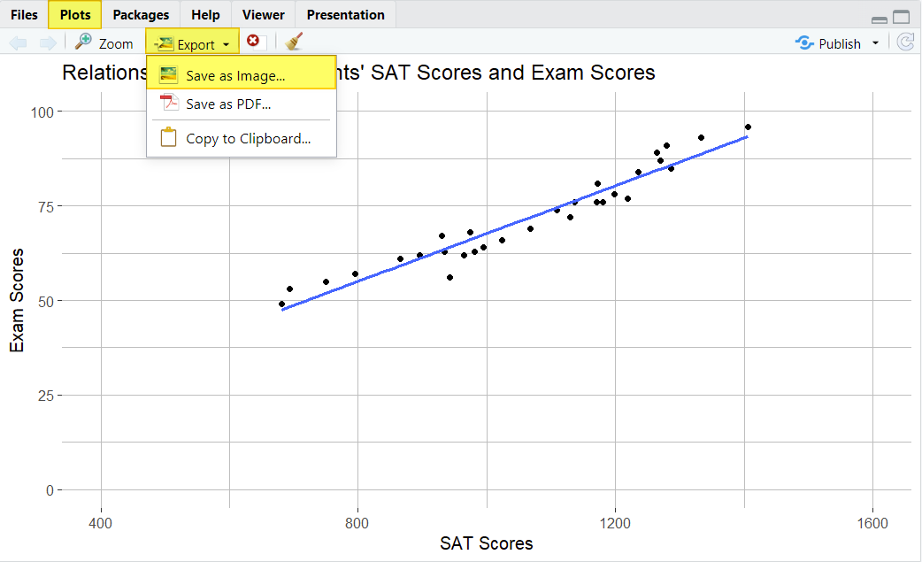
Saving Your Scatter Plot as an Image (Optional)
If you want to save your scatter plot as an image, you can easily do so.
From the Plots tab of the bottom right panel in RStudio, click Export and Save as Image…
This brings up the Save Plot as Image window below:
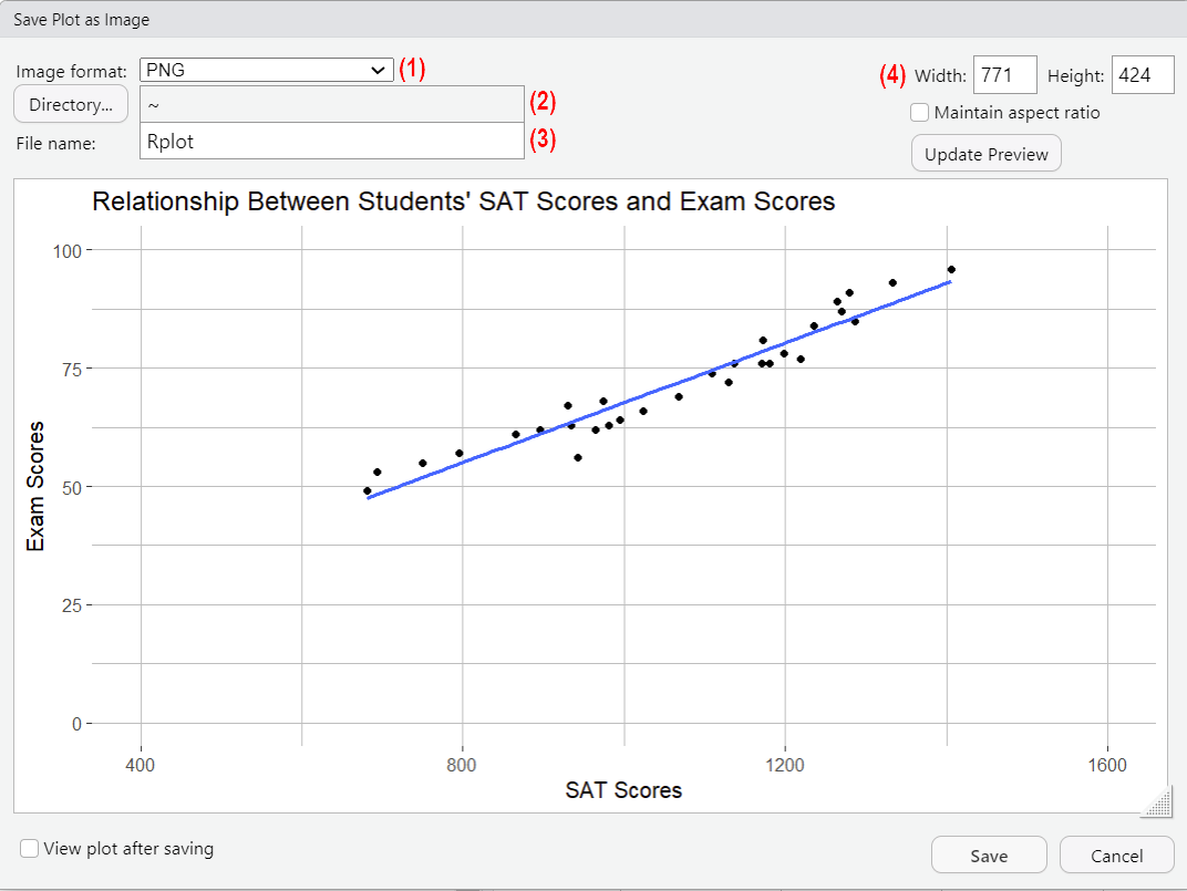
(1) Select the format that you want for your image file.
(2) To select the folder in which you want to save your image file, click the Directory… button and browse to that folder. Once you have navigated to this folder, click the Open button there.
(3) Overtype Rplot with the name that you want to assign to your image file.
(4) If desired, you can modify the size of your image here.
Click Save to save your image.
***************
That’s it for this tutorial. You should now be able to create a scatter plot in R and make simple changes to the formatting of your scatter plot.
***************