This tutorial will show you the quickest method to create a stacked bar chart to visualize the relationship between two variables in the SPSS statistical package.
Quick Steps
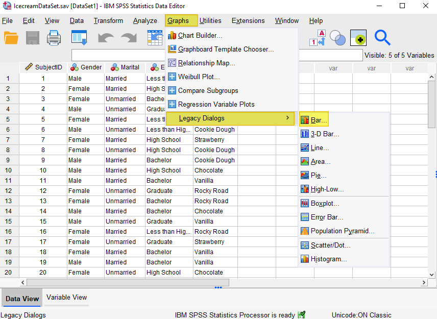
- Click Graphs -> Legacy Dialogs -> Bar
- Select “Stacked” and “Summaries for groups of cases”
- Click Define
- Move the variable you wish to display on the horizontal axis into the “Category Axis” box
- Move the second variable into the “Define Stacks by” box
- Select “Titles” to add a title (recommended)
- Click OK
- Double-click on your chart to open the “Chart Editor”
- Click on the “Scale to 100%” button
- Change the vertical axis label from “Count” to “Percentage”
- Select “X” to save your edits
The Data
As usual with these quick tutorials, the starting assumption is that you have already imported data into SPSS, and you’re looking at something like the data set below. (Check out our tutorials on importing data from Excel or MySQL into SPSS).
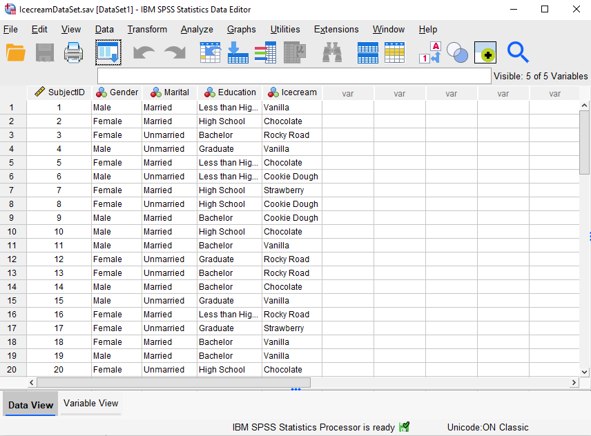
The data in this file (first 20 records displayed) represent the favorite ice cream flavor of each respondent, together with their gender, marital status, and level of education. We want to visualize the relationship between favorite ice cream flavor and gender. Specifically, we went to find out whether the distribution of favorite ice cream flavors for males is different from the distribution for females.
Create a Stacked Bar Chart
The simplest and quickest way to create a stacked bar chart in SPSS is to select Graphs -> Legacy Dialogs -> Bar, as illustrated below:
This brings up the following dialog box:
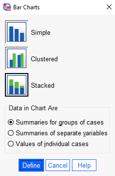
Select the “Stacked” bar chart icon. Under “Data in Chart Are’, select “Summaries for groups of cases.”
Click “Define.”
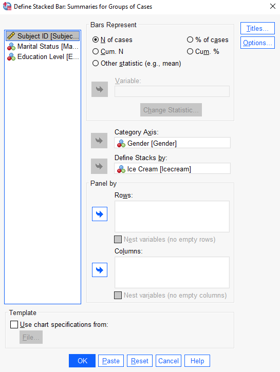
This brings up the “Define Stacked Bar: Summaries for Groups of Cases” dialog box below.
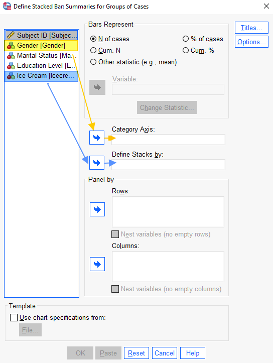
Select the variable that you wish to place on the horizontal axis of your bar chart (Gender in this example), and use the arrow button to add it to the “Category Axis” box. Then, select the other variable (Ice Cream in this example), and use the arrow button to add it to the “Define Stacks by” box.
We can leave the “Bars Represent” as “N of cases.”
It is a good idea to add a title to your chart. Select the “Titles” button, add your chart title, and select “Continue” to return to the “Define Stacked Bar: Summaries for Groups of Cases” dialog box.
Select “OK” to generate your chart.
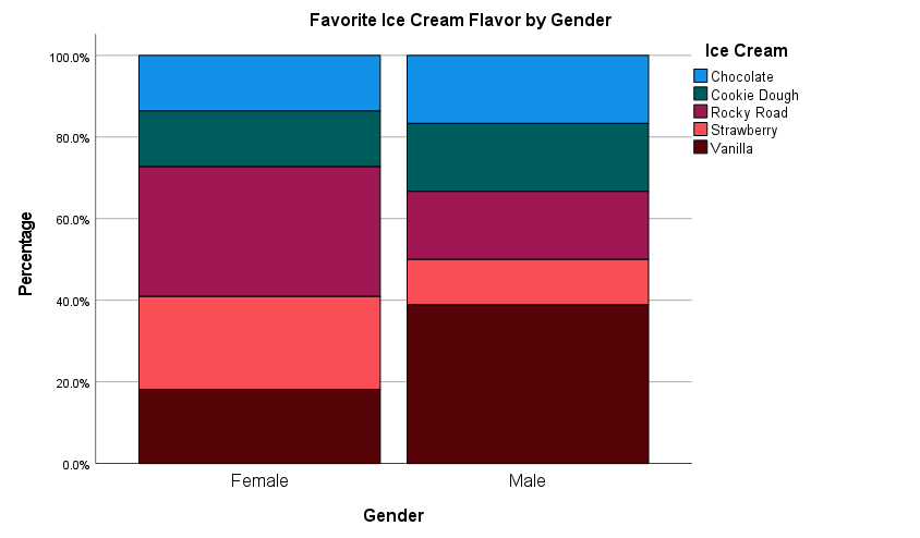
The Stacked Bar Chart
The SPSS Output Viewer will pop up with the stacked bar chart that you’ve created. However, you need to take a few additional steps to make it easier to interpret.
Double-click on your chart to open the “Chart Editor.”

Click on the “Scale to 100%” button.
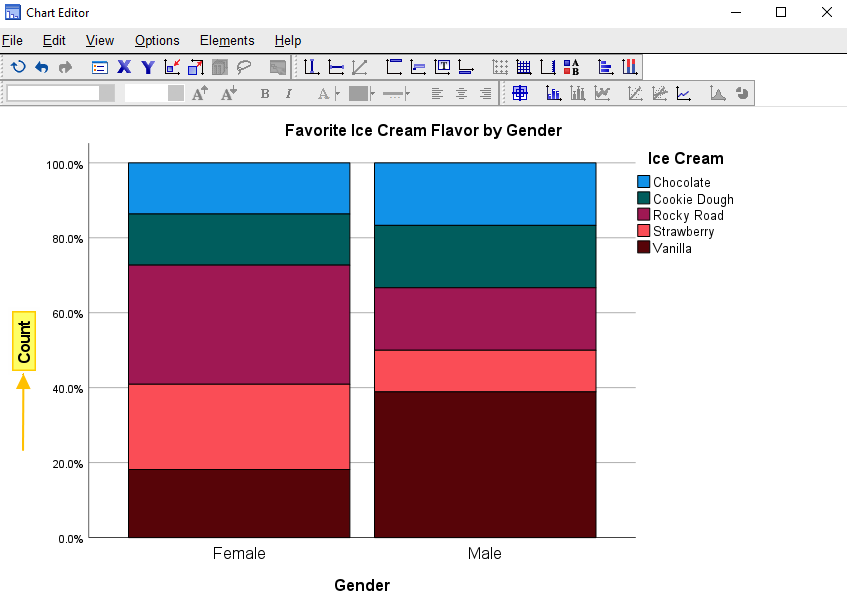
Click once on the vertical axis label “Count.” Click on the label again, and overtype it with “Percentage.” Select the X at the top right of the “Chart Editor” to save the edits to your chart. You will then see your edited chart in the Output Viewer.
If you want to save your chart, you can right-click on it within the Output Viewer, and copy it as an image file (which you can then use in other programs). Alternatively, check out our tutorial on exporting SPSS output to other applications such as Word, Excel, or PDF.
***************
That’s it for this quick tutorial. You should now be able to create a stacked bar chart within SPSS using one of its legacy tools. You may also be interested in our tutorials on editing bar charts in SPSS and formatting SPSS charts in APA style.
***************